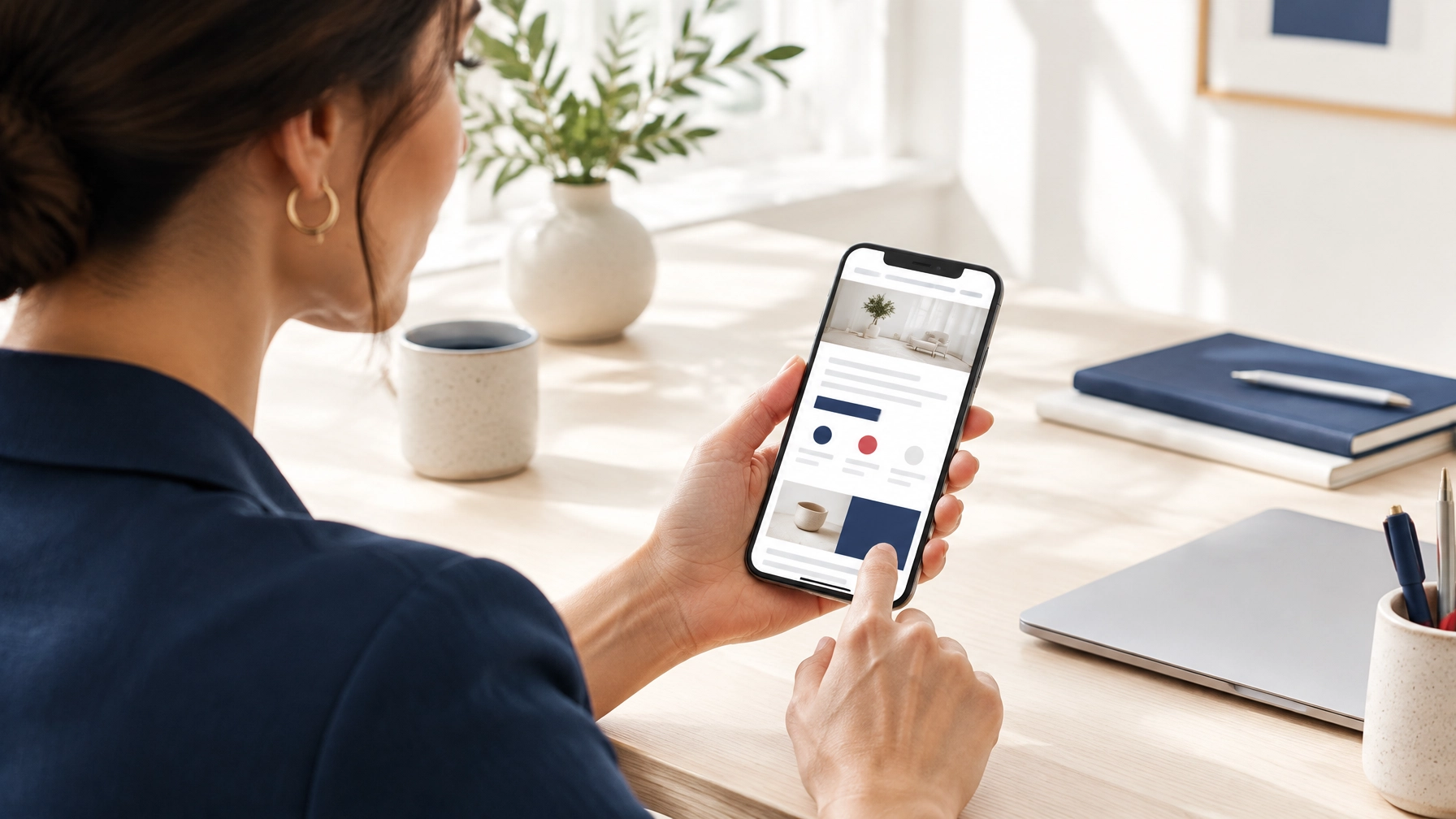
Your website may feel like home to you. You know exactly where the service list lives, which button starts a booking, and why that headline made sense at the time. But a first-time visitor does not share that context. They arrive with a single, urgent question: “Can this business help me?” If the answer is not immediately visible, they may leave before you ever get a chance to explain.
That is where the five-second test comes in. It is a quick, low-tech way to see your homepage through a stranger’s eyes. Show someone your site for five seconds, hide it, and ask three simple questions: What does this business do? Who is it for? What would you do next? Their answers—or their hesitation—tell you whether your first impression is doing its job.
Why First Impressions Matter More Than You Think
Visitors do not study your homepage. They scan it. Researchers who study web usability have found that people form an impression of a page in a fraction of a second, long before they read a single sentence. That impression shapes whether they stay, scroll, or click away. For a business owner, this is both a warning and an opportunity.
The warning is that familiarity can hide confusion. You know that the image in the hero section represents your team, that the small link in the corner leads to pricing, and that the slogan is an inside reference to your company’s history. A visitor knows none of that. They see a logo, a stock photo, and a sentence that could apply to a thousand other businesses.
The opportunity is that clarity is fixable. You do not need a complete redesign to make a first impression better. Often, a clearer headline, a more prominent location, or a single well-labeled button can turn a confusing homepage into one that welcomes the right customer. The five-second test helps you find those gaps without guesswork.
The Five-Second Test: A Simple Way to See What Visitors See
The five-second test is exactly what it sounds like. You show a person your webpage for five seconds, then remove it from view and ask them what they remember. Nielsen Norman Group describes this type of test as a way to gauge first impressions of a webpage. It is not a measure of your entire website, and it does not guarantee sales. It is a practical check on whether the most important information is easy to notice and understand.
The test works because it mimics real behavior. When a potential customer lands on your homepage, they are not reading every word. They are taking a quick glance and deciding whether to invest more attention. The five-second test compresses that moment so you can observe it directly. Instead of assuming what people see, you get evidence.
How to Run the Test Properly
Start with the right conditions. Use your own phone, since that is how many customers will first encounter your business. Open your homepage in a private or incognito browser window if you can. This removes your logged-in editing view, personalized recommendations, and any admin bars that might change what you see. You want the same experience a stranger would get.
Next, find someone who does not know your business. A friend, a colleague from another department, or a neighbor works well. Ask them to look at your homepage for five seconds. Count the seconds silently, then hide the screen. Ask the three questions: What does this business do? Who is it for? What would you do next? Do not explain anything before they answer. Listen for their first response, not the answer they arrive at after you hint at the right one.
Write down the words they use. Exact phrases matter. If they say, “It’s a business website,” that is a signal. If they say, “They provide family dentistry in town,” you have a much clearer picture of what your page communicates. If they hesitate or ask you a question back, that is useful data too.
If you cannot find someone available, you can try a self-test. Open your homepage, look for five seconds, and close it. Then write down what you remember. This is less objective because you already know your business, but it can still reveal whether your headline, imagery, and main button stand out. The goal is to notice what the page emphasizes, not to prove a point.
Three Phone Checks You Can Run Today
You do not need a lab or a budget to run a useful test. These three phone checks take only a few minutes, and they can surface the most common clarity problems. Run them in order, and take notes as you go.
1. The Five-Second Clarity Check
This is the core test described above. Show your phone screen to someone unfamiliar with your business, hold it for five seconds, then hide it. Ask the three questions and record the answers. Pay attention to whether the person can name a specific service, the kind of customer you serve, and the next step available.
A clear answer should sound like a short summary, not a vague category. “It’s a business website” is not enough. “They provide family dentistry in town” is useful. “They sell something online” is vague. “They sell handmade leather bags for cyclists” is specific. The more precise the answer, the better your homepage is doing its job.
If the person can explain what you do but not who it is for, you have a different problem. Your service may be clear, but your audience or location is not. If they can name the audience but cannot identify the next step, your call to action may be competing with too many other elements. Each gap points to a specific fix.
2. The First-Screen Check
Open your site on your phone and look only at what appears before you scroll. This is the first screen, often called “above the fold.” Can you find, without hunting, three things: what you offer, who or where you serve, and one clear next step such as calling, booking, or requesting a quote?
A logo, a broad slogan, and a large decorative image may look polished, but they often leave these questions unanswered. Designers love white space and big imagery, and those can be effective. But the first screen does not need to say everything. It needs to make the right things visible. A visitor should not have to study your navigation or decode a clever headline to understand the offer.
Use a simple checklist. Is the headline specific? Does it mention the service or the outcome? Is there a subheadline or short line that names the audience or location? Is there a button that says what happens next? If you have to squint, scroll, or guess, the first screen is not pulling its weight.
3. The Next-Step Check
Tap the main button or link. Does it take you where you expected? Can you complete the action on your phone? Try the full path: call the listed number, open the booking form, or send a test inquiry. Check that the text is readable, the fields are manageable, and the final confirmation is clear.
A button that says “Learn more” may not tell a visitor what happens next. “Request an estimate” or “Book an appointment” sets a clearer expectation. The same applies to forms. If a form asks for too much information upfront, or if the fields are difficult to tap, you may lose people who were ready to act. Test the entire journey, not just the button.
Look for friction points. Is the phone number clickable? Does the form work without errors? Is the confirmation message reassuring? A visitor who cannot complete the next step on their phone is a visitor you may never hear from again.
What a Failed Check May Be Telling You
A missed answer does not automatically mean you need a new website. It points to a question worth investigating. The five-second test is a first signal, not a final diagnosis. Here are four common patterns and what they may indicate.
People cannot explain what you do. Your headline may be vague, your service may be buried, or your imagery may compete with the message. If the first thing people see is a beautiful photo of a landscape and the headline says “Welcome to our website,” you have given them mood but not meaning. A specific headline that names the service or outcome will do more work.
They understand the service but not who it is for. Your audience, location, or specialty may need a more prominent place. A dentist who serves families in a specific town should say so. A consultant who works with nonprofits should name that niche. The clearer the audience, the more the right visitors feel seen—and the faster the wrong visitors can leave.
They see the offer but cannot identify the next step. Your page may have competing buttons, unclear wording, or no obvious primary action. When everything is highlighted, nothing is. Choose one main action and make it visually dominant. Secondary actions can exist, but they should not compete with the primary one.
They understand the page but cannot use it comfortably. Small text, slow loading, crowded layouts, or difficult forms may be adding friction on mobile. A page can be clear in concept but painful in practice. If the text is too small or the buttons are too close together, visitors may give up even when they understand the offer.
From Quick Check to Measured Review: When to Dig Deeper
The five-second test is a powerful starting point, but it has limits. It cannot reveal every issue with performance, search visibility, or the path from visit to inquiry. A page might pass the five-second test and still fail to convert because it loads slowly, has broken links, or is invisible to search engines.
That is where a professional website audit adds value. At SiteGooRoo, an audit reviews more than 100 items across areas such as mobile experience, page speed, search visibility, content, broken links, and technical health. The aim is to turn findings into a prioritized list, not a wall of scores, so you can see what matters and what to address first.
An audit can include refining the homepage message, improving the order of information, making the main action easier to find, or identifying a technical issue that prevents search engines from seeing key pages. The right fix depends on what the review uncovers. Sometimes the change is a clearer headline or a better-placed contact button. Sometimes the site needs broader work across its mobile layout, content, or search setup.
For more on common points of friction, see SiteGooRoo’s article on whether your website is creating friction. If the page feels slow or difficult to use on a phone, a guide to fixing a slow website on mobile may also help.
Making the Fixes That Matter Most
Once you have run the three checks, resist the urge to redesign everything. Start with the smallest change that addresses the biggest gap. If people cannot explain what you do, rewrite the headline. If they cannot tell who the service is for, add a clear line about your audience or location. If they cannot find the next step, simplify the buttons and make the primary action obvious.
Clarity beats cleverness. A headline that says exactly what you offer will outperform a clever phrase that requires explanation. A button that names the action will outperform a generic “Learn more.” A first screen that shows the service, the audience, and the next step will outperform a beautiful image that says nothing.
Test again after you make changes. Ask another person to run the five-second test. Compare the answers. If the new version produces clearer responses, you are moving in the right direction. If not, keep refining. The goal is not perfection; it is progress toward a homepage that works for the people who matter most.
Turn a Five-Second Glance into a Long-Term Advantage
Your website has a brief moment to make an answer visible. The five-second test helps you see whether that moment is working. Run the three phone checks—clarity, first screen, and next step—and treat the results as a starting point, not a verdict. A quick test can reveal what a visitor sees first; a careful review can uncover what holds the whole experience together.
If you have been asking, “Is my website working for my business?”, begin with these checks. They take only a few minutes and can show whether a first-time visitor understands your offer, recognizes that it is meant for them, and knows what to do next. Then, if you want a deeper look, request a free SiteGooRoo website audit for a clear review of what is working, what may be getting in the way, and which improvements deserve attention first. No obligation—just a measured next step toward a website that serves your business around the clock.