A patient’s journey rarely begins in your waiting room.
It begins with a late-night search, a tap on a link, and the first impression formed within seconds.
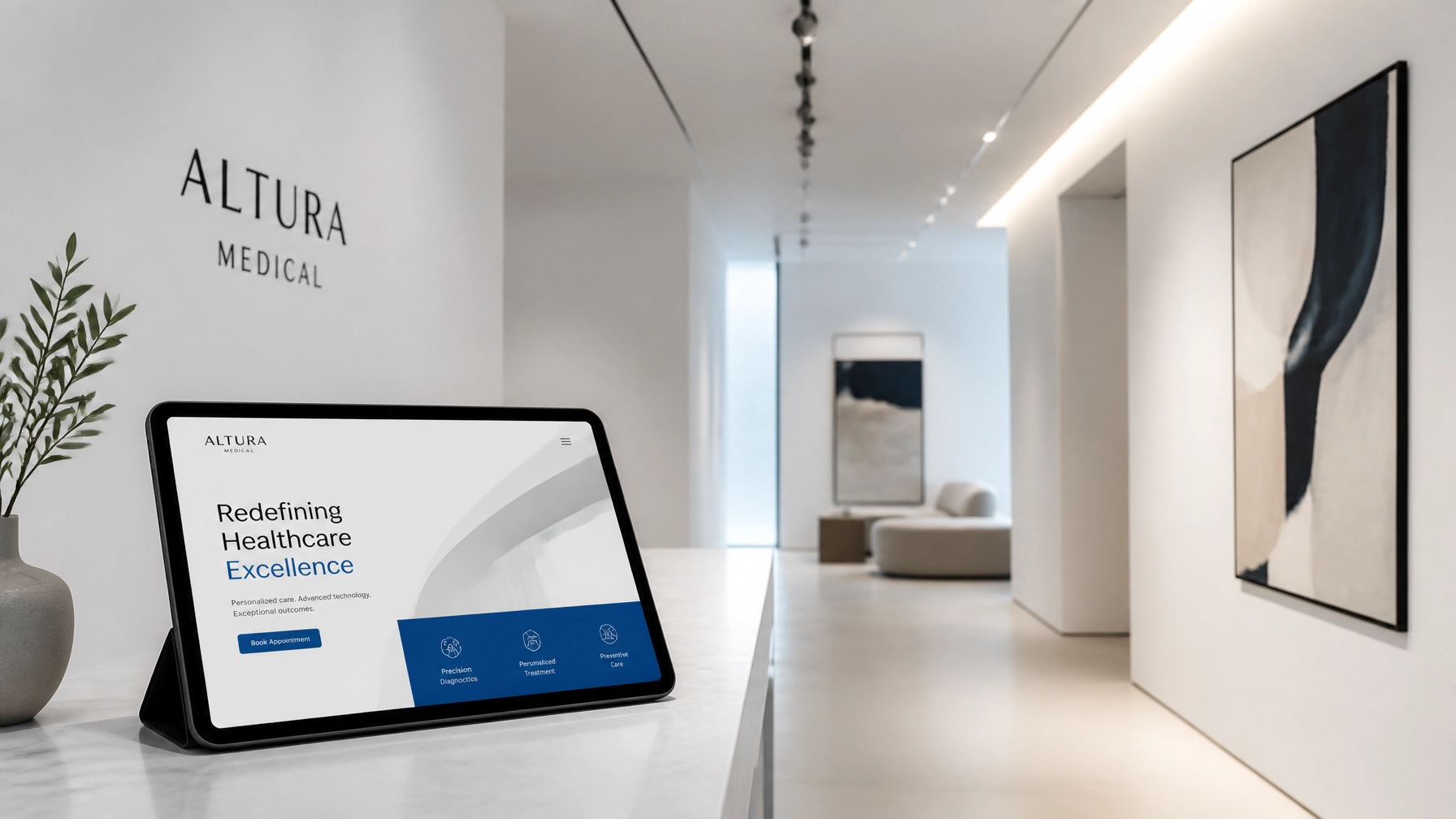
In that moment, your website is your digital lobby—your first handshake, your clinical tone, and your proof of competence. If that experience is confusing, slow, or insecure, the patient leaves before you ever know they visited.
In a competitive healthcare market like Wilmington, NC, your website is no longer a brochure.
It is an operational asset for patient acquisition and retention.
Below are five clinical red flags that signal your website may be driving patients away—and how to diagnose and treat each one.
1. The Broken Seal: Missing SSL Certification
Trust is the currency of medicine.
Online, that trust is visually represented by a simple padlock icon and the “https” in your URL.
When a browser displays a “Not Secure” warning next to your site, patients instantly question your professionalism and safety.
Why SSL Matters for Medical Practices
An SSL (Secure Sockets Layer) certificate encrypts data transmitted between a user’s browser and your server.
Without it:
- Contact form submissions (names, phone numbers, health concerns) can be intercepted.
- Patients who know basic digital safety will abandon your site at the first warning.
- Modern browsers may block or discourage access to non-secure pages.
- Google and other search engines penalize non-secure sites in rankings—especially for local searches.
For a medical practice that handles sensitive information and operates under HIPAA considerations, a missing SSL certificate is not just a technical oversight.
It is a direct threat to patient confidence.
Practical Fix: Encrypt the Entire Site
To eliminate this red flag:
- Install a full-site SSL certificate via your hosting provider or a managed service.
- Force HTTPS across all pages, including landing pages, images, and embedded forms.
- Set auto-renewal so your certificate never expires and never shows a security warning.
- Verify mixed content issues, ensuring every resource (scripts, images, styles) loads securely.
Result: Patients see a secure padlock, feel more comfortable sharing information, and search engines reward your site with better visibility.
2. The Hidden Entrance: Buried Contact Information
In a medical context, clarity is a form of compassion.
Visitors are often stressed, in pain, or rushing between obligations.
If your phone number, address, or “Book Appointment” button is hidden in the footer or buried in a subpage, you are multiplying their frustration.
Common Contact UX Failures
Medical practice websites frequently suffer from:
- Contact details only in the footer or a single “Contact” page.
- No persistent navigation item for Appointments or Call Us.
- Long, text-heavy pages with contact information buried mid-paragraph.
- Multiple phone numbers and locations listed without clear hierarchy.
This forces users to hunt for critical information—an unnecessary cognitive load that leads to site abandonment.
Practical Fix: Build a Clear Layout Spine
Think of your contact information as the spine of your layout.
Wherever a patient is on your site, they should be able to:
- Call your office in one click from a clearly visible phone number.
- Book an appointment via a persistent button in a sticky header.
- See your Wilmington NC location (address, map link) in high-visibility zones.
Implementation ideas:
- Add a sticky header with a concise phone number and “Request Appointment” CTA.
- Place a simple contact block (phone, address, hours) in your hero section.
- Include short, clear CTAs at the end of key pages: services, providers, and insurance.
Result: Patients can act quickly, with minimal friction, and your site feels intentional rather than chaotic.
3. The Slow Pulse: Low Loading Velocity
Performance is a measure of respect.
If your pages take longer than 2.5 seconds to load, many visitors will leave before seeing your first image.
A slow site signals an outdated operation, even if your clinical care is cutting-edge.
How Speed Impacts Patient Behavior
Slow load times cause:
- Higher bounce rates, especially on mobile.
- Lower conversion on forms and online scheduling.
- Poor performance on Google’s Core Web Vitals, which influence search rankings.
In a market like Wilmington, NC—where patients can compare local providers in seconds—a slow website is a silent competitive disadvantage.
Common Causes of Digital Drag
Medical websites often slow down due to:
- Oversized, uncompressed hero images and provider photos.
- Legacy plugins and scripts that are no longer needed.
- Low-quality shared hosting with limited resources.
- Excessive tracking scripts added over years without review.
Practical Fix: Optimize for Surgical Speed
To improve loading velocity:
- Audit page speed using tools like Google PageSpeed Insights or GTmetrix.
- Compress and resize images, targeting modern formats (WebP) and appropriate dimensions.
- Remove legacy scripts and plugins that do not serve a clear purpose.
- Implement caching and a CDN to serve content quickly across regions.
- Upgrade hosting to a performance-focused provider that aligns with your traffic volume.
Result: Your site loads with a “smooth rhythm,” reinforcing your professionalism and improving both user experience and search rankings.
4. The Crowded Hallway: Cluttered UX and UI
A cluttered interface creates mental noise.
Too many colors, fonts, pop-ups, and dense paragraphs overwhelm visitors and dilute your message.
In healthcare, your digital environment should communicate calm authority.
The Role of Quiet Luxury in Healthcare Design
A high-performing medical website should feel like a well-designed clinic lobby:
- Clean lines and thoughtful spacing.
- Limited, consistent color palette.
- Clear typography without decorative distractions.
- Intuitive navigation that guides visitors, not confuses them.
Abundant white space is not “empty.”
It is what allows patients to focus on what matters: your services, your expertise, and your outcomes.
Signs Your UX Is Over-Engineered
You may have a cluttered digital hallway if:
- Every section tries to say everything at once.
- Multiple buttons compete for attention on the same screen.
- Banners, sliders, and pop-ups overlap, especially on mobile.
- Important information (services, insurance, location) is buried under marketing jargon.
Practical Fix: Distill the Narrative
Refine your interface by:
- Prioritizing 1–2 key actions per page (e.g., learn about a service, book an appointment).
- Reducing color usage to a primary brand color, a neutral, and an accent.
- Breaking content into short sections with descriptive subheadings.
- Using bullet lists for benefits, services, and FAQs instead of dense paragraphs.
Result: Patients experience visual calm.
They can quickly understand who you are, what you do, and how to take the next step.
5. The Missing Address: Lack of Local Schema
Your website must speak two languages: human and machine.
For search engines, Local Schema markup is the machine-readable description of your practice.
Without it, your visibility for queries like “physician near me” or “pediatrician Wilmington NC” is severely limited.
What Local Schema Communicates
Schema markup can tell Google and other search engines:
- Your exact business name and medical specialty.
- Your GPS coordinates and physical address.
- Your office hours and accepted insurances.
- Your phone number and main contact options.
- Your patient reviews and ratings.
If this data is missing, inconsistent, or outdated, your local search presence becomes fragile.
You may appear below less qualified competitors simply because they communicate better with search engines.
Practical Fix: Implement Precise JSON-LD Schema
To turn your site into a signal-rich asset:
- Identify the correct Schema type (e.g.,
MedicalClinic, Physician, or Dentist). - Use JSON-LD format to include name, address, coordinates, phone, hours, and specialties.
- Connect Google Business Profile, online reviews, and appointment URLs.
- Validate with Google’s Rich Results Test and keep schema updated as details change.
Result: Search engines understand exactly who you are and where you are, improving your chances of appearing in the local map pack and being discovered by nearby patients.
The Outcome: Digital Composure
“Design is not just what it looks like and feels like. Design is how it works.” – Steve Jobs
A medical website should be a frictionless extension of your care.
When security, clarity, speed, visual calm, and local signaling are aligned, your site becomes an instrument of digital composure.
Patients feel the same reassurance online that they expect in your waiting room.
Addressing these five red flags is more than a cosmetic refresh.
It is a strategic realignment of your digital presence with the standards of modern healthcare.
For practices in Wilmington, NC and similar markets, this alignment directly impacts patient acquisition, retention, and reputation.
Assurance Through Forensic Review
If you suspect your current website is a barrier to growth, the next step is not guesswork—it is analysis.
A structured forensic review by SiteGooRoo.com can:
- Identify points of friction in navigation, content, and performance.
- Reveal security gaps and compliance risks.
- Uncover missed opportunities in local search and schema.
- Provide a prioritized roadmap for redesign and optimization.
Partnering with a team, like SiteGooRoo, focused on measured results allows you to treat your website like a living system—not a static brochure.
By engineering your digital presence with the same precision you apply to clinical care, you create a website that attracts, reassures, and retains patients.
The takeaway: your website is either a high-performing asset or a quiet liability.
Investing in its health is investing in the long-term growth and stability of your medical practice. Contact us for a free 100-point website audit.