Digital presence is often reduced to a series of metrics—clicks, impressions, bounce rates. But beneath every analytics dashboard is something far more primitive: a human being making a snap judgment. Long before a visitor reads a headline or compares your pricing, they’ve already decided if they trust you.
That decision happens fast.
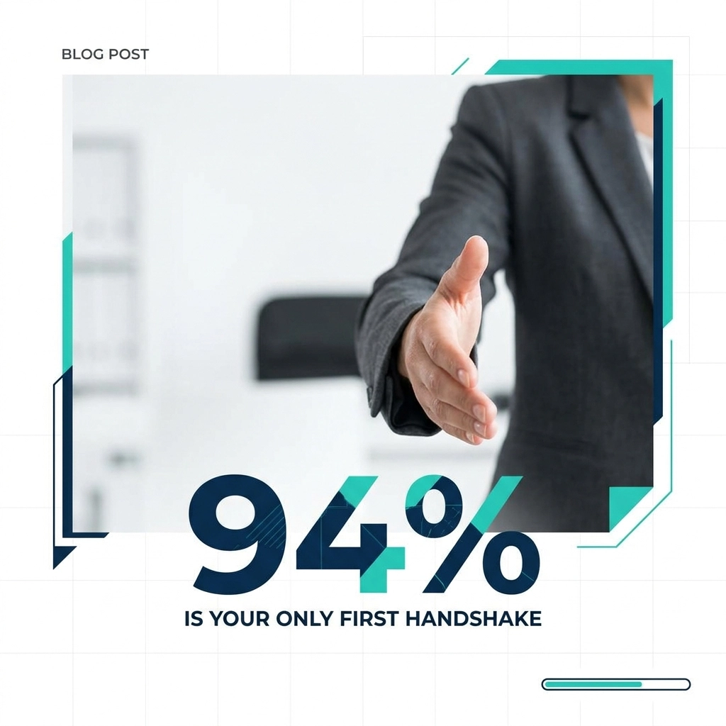
Research shows it takes about 50 milliseconds—0.05 seconds—for someone to form an opinion about your website. In that fragment of time, your copy is irrelevant. Your offers are invisible. All that exists is design: white space, contrast, hierarchy, and rhythm.
This is the 94% Rule: 94% of first impressions are design-related. Only 6% come from the actual content.
For local businesses in Wilmington, Myrtle Beach, and beyond, this rule is the difference between a high-performing digital asset and a very expensive digital paperweight.
The Primitive Response: Design as a Proxy for Competence
The human brain is a pattern-recognition machine. When someone lands on your website, they’re not consciously evaluating every detail. Instead, they’re scanning for one thing: order.
Order tells the brain, “This is safe. This is competent. This is worth my time.”
Disorder—cluttered sidebars, inconsistent fonts, mismatched colors, and awkward spacing—creates cognitive friction. That friction feels like a threat. Visitors may not be able to explain why they don’t trust a site, but they know one thing: they’re not staying.
How Poor Design Translates Into Distrust
When design is neglected, visitors subconsciously read it as:
- Lack of professionalism – “If they don’t care about their own site, will they care about my project?”
- Lack of discipline – “If they miss details here, what will they miss in the work they do for me?”
- Lack of stability – “Does this business even take itself seriously?”
The logic is brutal but simple: your website is your storefront. If the digital front door is crooked, dusty, and hard to open, people assume the same about everything behind it.
Most small businesses focus heavily on the what—their services, their experience, their pricing—while neglecting the how: the visual delivery. That’s the core of the 94% Rule.
The solution isn’t “making it prettier.” The solution is forensic design.
Instead of treating your website as a gallery of information, you treat it as an architecture of trust.
The Architecture of Silence: Quiet Luxury in Web Design
In digital design, real luxury is not found in more; it’s found in restraint.
This is what we call Quiet Luxury—the discipline of removing everything that’s unnecessary until only the essential remains. It’s not about being minimal for the sake of aesthetics; it’s about making every element earn its place.
The White-Cube Gallery Metaphor
Think of a high-end art gallery. The walls are white and mostly empty. There’s space—sometimes too much space. But that emptiness is intentional. It exists to direct your attention where it belongs: the art.
Your website should work the same way.
- Spacious layouts let your message breathe.
- Clear focal points tell visitors what matters most.
- Intentional white space signals calm, control, and confidence.
You’re not shouting for attention with flashing banners and competing colors. You’re inviting visitors into a controlled, professional environment where the next step is obvious and comfortable.
When we analyze common Wilmington, NC web design mistakes, one problem shows up over and over: visual noise.
Business owners try to say everything at once:
- Every service in the main navigation
- Multiple sliders on the homepage
- Three different fonts and five button styles
- Overcrowded “About” sections and walls of text
The result is a site where nothing is truly heard.
Quiet luxury flips that script. You stop trying to impress everyone and start clearly guiding the right people.
A Forensic Breakdown of the 94%
To understand why design carries so much weight, you need to look at the specific elements your visitors are unconsciously judging in those first 50 milliseconds.
1. Visual Hierarchy: The Spine of the Experience
The eye doesn’t wander randomly; it follows a path.
A strong visual hierarchy answers these questions instantly:
- Where should I look first?
- What’s the main point of this page?
- What’s my next step?
When hierarchy is weak:
- Headlines don’t stand out from body copy
- Buttons blend in with the background
- Sections all compete for attention
This leaves visitors feeling lost—and lost visitors don’t click.
Forensic fix:
- Use a clear, dominant headline on each page
- Make primary calls-to-action visually distinct and consistent
- Group related content together and separate sections with whitespace
2. Color Psychology: Emotion in One Glance
Color is not decoration. It’s emotional signaling.
A medical practice in Wilmington needs a different palette than a construction firm or a coastal restaurant. You’re not just “picking colors you like”; you’re choosing the emotional environment your visitors will experience.
Examples:
- Blues and cool neutrals → trust, calm, credibility (great for finance, medical, legal)
- Deep greens → stability, nature, growth (great for wellness, environmental, landscaping)
- Rich oranges and reds → energy, urgency, appetite (great for restaurants, promotions)
Forensic fix:
- Choose 1 primary brand color, 1 accent color, and 2–3 neutrals
- Ensure contrast is high enough for readability (especially for buttons and text)
- Use accent colors sparingly to create focus, not chaos
3. Typography: The Silent Voice of Your Brand
The font you choose—and how you space it—carries a voice even before a single word is read.
- Serif fonts (with small “feet” on the letters) imply tradition, formality, and stability
- Sans-serif fonts (clean, without feet) imply modernity, clarity, and efficiency
Typography errors that instantly erode trust:
- Too many font styles (more than 2–3 is usually overkill)
- Tight line spacing that feels cramped
- Long line lengths that tire the eye
Forensic fix:
- Use one font for headings, one for body text
- Keep line length around 50–80 characters for readability
- Increase line-height slightly to create a sense of calm and space
4. Responsive Integrity: The Handshake on Mobile
If your site breaks on a phone, your handshake is withdrawn.
For many local businesses, more than half of traffic is mobile. If your menu is hard to tap, text is tiny, or sections overlap, visitors don’t complain—they disappear.
Forensic fix:
- Test every key page on multiple devices and screen sizes
- Ensure buttons are finger-friendly (at least ~44px high)
- Stack content vertically in a logical order for mobile
When visual hierarchy, color psychology, typography, and responsive integrity align, the result is a frictionless experience. Visitors feel ease. They experience your brand as competent and trustworthy before they read a single testimonial.
The Human Element in an AI-Driven Web
As AI-generated content floods the internet, websites are starting to look and feel the same: template layouts, generic stock imagery, and SEO copy that hits keywords but misses character.
AI can write a blog post. It can suggest layouts. But it struggles with the nuance of local brand DNA.
Human-centric design is the antidote.
A skilled designer can:
- Sense when a layout “feels off” in a way no algorithm currently can
- Capture the specific texture of your local market—Wilmington is not Myrtle Beach, and neither is Charleston
- Balance best practices with brand personality so your site is both searchable and memorable
SEO and AI search are vital for discovery. They help people find you.
But they don’t close the deal.
Design closes the deal. It’s the difference between reading a script and shaking a real hand. Between a bot response and a genuine, confident introduction.
The Hidden Cost of Visual Debt
Many businesses are carrying a burden they can’t see: Visual Debt.
Visual debt happens when:
- Your site was built years ago on an outdated template
- You DIY’d the design using a builder with limited controls
- You’ve layered quick fixes and one-off changes over time
Each small compromise seems harmless. But over time, that debt compounds.
You pay for it in ways that rarely show up on a simple analytics report:
- Leads that bounced before they ever read your offer
- Referrals who checked your site and quietly decided to move on
- Ad spend and social campaigns that drive traffic to a site 94% of visitors instinctively distrust
This is why a website design audit is not a luxury; it’s a diagnostic necessity.
Just as a physical structure needs a structural engineer to identify cracks, a digital structure needs a forensic review to identify friction points where trust is leaking.
Case Study: From Digital Business Card to Lead Machine
Consider a professional services firm in Myrtle Beach.
Their original website behaved like a static business card. It existed, but it didn’t persuade. There was no visual rhythm, no clear path, and no emotional signal of authority.
Applying the 94% Rule, the redesign focused on precision, not just aesthetics.
The Forensic Approach
We focused on three key shifts:
Restrained Typography
A clean type system with deliberate hierarchy signaled authority and maturity. Headlines guided the eye, while body text was comfortable to read.
Spacious Layouts
We removed unnecessary sections and created breathing room between content blocks. This reduced cognitive load and made key messages instantly scannable.
Strategic Imagery
Instead of generic stock photos, we used images that reflected local context and real-world scenarios their clients would recognize.
The Outcome
- Time-on-site increased measurably
- Contact form submissions rose by 40%
- The firm began hearing new prospects say, “We felt like you were the most professional option before we even spoke to you.”
The content itself didn’t change dramatically. The delivery did—and the delivery is what the 94% Rule is all about.
Designing for Local Authority in Wilmington and Beyond
In markets like Wilmington, NC, your competitors are only a click away. The goal is not to be the loudest; it is to be the clearest.
A site that looks and feels like it could belong to a surgeon or an engineer communicates something powerful:
- You value precision
- You respect your visitor’s time
- You invest in quality
This is how you build local authority.
You’re not just another listing in a directory. You become the business that feels like a safe, competent, trustworthy choice.
That’s the essence of being a true “GooRoo”: someone who balances deep technical skill with a sticky, human partnership. A guide who isn’t just selling a website, but engineering a reliable digital asset.
From Noise to Clarity: Your Invitation to Assurance
Your website is speaking for you 24/7.
The question is: what is it saying when you’re not in the room?
If your current site feels more like a digital paperweight than a digital partner, it’s not a sign of failure. It’s a signal that you’ve reached the limit of guesswork.
You can’t fix what you haven’t measured.
What a Forensic Website Design Audit Reveals
A professional, high-leverage website design audit can uncover:
- Design elements that are quietly eroding trust
- Layout issues that confuse rather than guide
- Visual debt that has accumulated over years of small compromises
- Missed opportunities to showcase local authority and clarity
Armed with this insight, you can finally align the first handshake (your design) with the value you already deliver every day.
At SiteGooRoo, the mission is simple: not just to build websites, but to engineer high-performing digital assets that behave like your most reliable team member—on duty, on brand, and on your side.
If you’re ready to move from noise to clarity, it’s time for a forensic intervention.
Let the 94% work for you, not against you.
Visit SiteGooRoo.com to secure your Free Website Design Audit and make sure your digital handshake is firm, clear, and quietly confident.