Design is rarely about decoration. It is about intention.
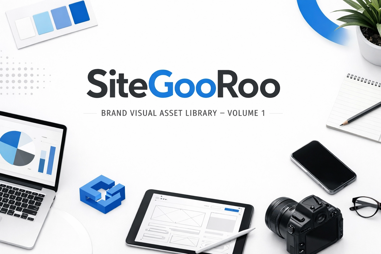
In a digital world saturated with noise, most local businesses are pressured into louder colors, bolder claims, and busier layouts. Yet the brands that feel the most trustworthy rarely shout. They communicate through clarity, consistency, and deliberate visual choices. That is the spirit behind the SiteGooRoo Brand Visual Asset Library — Volume 1.
SiteGooRoo treats a website not as a collection of pages, but as a high-leverage engine for growth. To build that engine, you need more than code. You need a visual language that communicates precision, reliability, and local relevance.
This library is our first formal collection of that language.
Why a Visual Asset Library Matters for Local Businesses
Most local business owners do not wake up thinking about typography, color systems, or visual hierarchy. You think about clients, operations, and delivering your craft. Yet every touchpoint — your website, social media, emails, and ads — is sending a visual signal about how seriously you take your work.
A curated visual asset library gives your brand:
- Reduced friction: Prospects spend less energy figuring out who you are and more time engaging with your services.
- Perceived value: Premium, consistent visuals justify higher price points and reinforce trust.
- Scalable consistency: As you do more marketing, your message grows without your brand feeling diluted or improvised.
Design, when done well, becomes infrastructure. It is the visual spine that holds your digital presence together.
Quiet Luxury and Signal-Driven Design
The modern digital landscape rewards loudness, but local buyers reward composure. Our philosophy at SiteGooRoo is what we call Quiet Luxury: sophisticated, understated, and authoritative.
Instead of visual noise, we focus on:
- Signal over spectacle: Every element should communicate something meaningful.
- Calm confidence: Minimalism and clarity that instill trust, not anxiety.
- Human-centered rigor: Technology in service of real people and local relationships.
Volume 1 of the SiteGooRoo Brand Visual Asset Library is built around ten visual pillars — not just images, but metaphors for how we engineer digital growth.
The Ten Pillars of Volume 1
Below is an overview of each visual direction and how it supports a coherent, high-performing brand presence.
1. The Blueprint: Isometric 3D Wireframes
Challenge: How do you show the invisible structure that makes a website perform?
Approach: We use isometric 3D blueprints that strip away surface design to expose the underlying skeleton — the layout spine that quietly directs visitors from curiosity to conversion.
Outcome: Clarity. Clients finally see why the structure matters. Instead of arguing about colors or buttons, the conversation shifts to flow, priorities, and growth.
This blueprint visual embodies our promise: Digital Growth Engineered for Local Success. It reminds everyone involved that a website is first and foremost an engineered system, not a collage of widgets.
2. The Intersection: Macro Sprout and Circuit Board
Challenge: Technology can feel cold, while local business is inherently human and organic.
Approach: A macro photograph of a living sprout emerging from the intricate paths of a circuit board.
Outcome: A powerful metaphor for technical precision fueling real-world growth.
This is how we see Data-Driven SEO: not as numbers in a dashboard, but as nutrients feeding your business. The visual reassures owners that analytics and algorithms are not abstract — they are the roots system helping your brand take hold in its local market.
3. The 24/7 Engine: Glowing Clockwork
Challenge: Communicating that a well-built website never sleeps, never gets tired, and never stops working for you.
Approach: A glowing, translucent clockwork mechanism, all gears in motion, humming with quiet power.
Outcome: A sense of perpetual motion and refined engineering, without chaos or clutter.
A SiteGooRoo site is a silent partner. It handles inquiries, nurtures leads, and builds authority while you focus on your craft — or rest. This visual speaks to the mental clarity of knowing your digital presence runs on a precise, unbreakable rhythm.
4. The Connection: Abstract Organic Light Fibers
Challenge: Social media is often reduced to noise and superficial engagement, but real growth depends on authentic connection.
Approach: Soft, organic fibers of light weaving together against a dark, calm backdrop.
Outcome: A sense of living, breathing connectivity that feels human rather than clinical.
We use this visual to represent Social Media Marketing as a set of threads — ongoing conversations, touchpoints, and moments of recognition. The fibers echo your brand voice as it travels across Facebook, Instagram, LinkedIn, and beyond, creating a consistent visual tempo rather than random bursts of activity.
5. The Territory: Stylized Map with Glowing Nodes
Challenge: Most map graphics are cluttered or overly literal, making it hard to communicate strategic local dominance.
Approach: A minimalist, dark-themed map with glowing nodes marking strategic hubs, not every street and landmark.
Outcome: An elevated, authoritative view of your local market footprint.
For a local business, the map is the battlefield. This visual symbolizes how we think about local SEO and targeting: less about serving everyone, more about owning the right pockets of demand. Through forensic review and strategic placement, we identify where your signal needs to be strongest and build from there.
6. The Solution: Macro Wooden Puzzle on Screen
Challenge: Explaining the difference between generic digital services and a truly bespoke solution.
Approach: A single, high-quality wooden puzzle piece fitting perfectly into the frame of a digital screen.
Outcome: A clear metaphor for fit — the feeling that your website was built specifically for your business.
We are not interested in one-size-fits-all templates. Each SiteGooRoo build is a sequence of deliberate, hand-fitted decisions. The puzzle piece visual reminds clients that the right solution should click into place, not be forced.
7. The Workspace: Minimalist Designer Desk
Challenge: Bridging the gap between invisible technical work and the human craft behind it.
Approach: A top-down view of a minimalist desk — a notebook, a pen, a single device, ample white space.
Outcome: Quiet authority, precision, and focus on quality over quantity.
We believe a cluttered workspace often leads to a cluttered site. Our process leans into “white-cube gallery” levels of cleanliness: intentional whitespace, disciplined layouts, and restrained typography. This visual anchors the idea that every pixel on your site is a deliberate, human decision.
8. The Filter: Data Streams and the Prism
Challenge: Turning raw data, analytics, and reporting — often overwhelming for business owners — into something intuitive and actionable.
Approach: Pure white data streams enter a glass prism and emerge as a spectrum of organized, differentiated light.
Outcome: A visual explanation of analytical rigor and strategic clarity.
Data in its raw form is noise. When passed through the right framework, it becomes guidance. We use this asset to show how our process filters metrics, behavior, and search trends through a strategic prism to produce clear next steps, not just dashboards.
9. The Texture: Pixels and Oil Paint
Challenge: Connecting the tactile, physical world of craftsmanship to the intangible nature of digital design.
Approach: An abstract blend where crisp digital pixels gradually dissolve into the rich texture of oil paint.
Outcome: A sophisticated, timeless aesthetic that feels both modern and rooted in classic artistry.
This is our visual shorthand for Quiet Luxury. We embrace cutting-edge technology, but our sensibilities are anchored in curation, restraint, and long-term value rather than trends. For local businesses, this signals that your digital presence will age gracefully, not expire with the next algorithm update.
10. The Guide: Minimalist Lighthouse with Binary Beam
Challenge: Positioning your brand as a calm, reliable beacon in a saturated digital seascape.
Approach: A stark, minimalist lighthouse casting a beam composed of binary code instead of light rays.
Outcome: A bold, instantly understandable metaphor for direction, guidance, and leadership.
In a sea of digital noise, your brand has to be the signal. The lighthouse represents our role as the Web GooRoo: guiding your business through complexity with technical expertise, ethical strategy, and a steady hand.
The Visual Spine: From Random Assets to a Cohesive Ecosystem
Most websites struggle not because the owner lacks ambition, but because the brand lacks a visual spine.
Common symptoms include:
- Every page looks slightly different.
- Social media posts feel disconnected from the website.
- Ads and landing pages look temporary or off-brand.
- New design decisions are made in isolation, not in alignment.
A visual asset library reverses this. Instead of improvising every time you need an image, you draw from a curated ecosystem:
- Hero sections use structured visuals like The Blueprint or The 24/7 Engine to convey reliability.
- Service pages tap into The Solution and The Workspace to highlight custom fit and human craft.
- SEO and data reports reference The Filter and The Territory to make complex strategy understandable.
- Social content leans on The Connection and The Texture to reinforce tone and personality.
Over time, your audience begins to recognize your brand not just by your logo, but by your visual language.
The Forensic Review: Finding the Signal in Your Current Presence
Before we prescribe, we diagnose. A forensic review of your digital presence looks at your:
- Website structure: Does your layout have a clear spine, or is it a patchwork of disconnected decisions?
- Visual consistency: Are your colors, imagery, and typography unified across web, social, and ads?
- Message alignment: Do your visuals reinforce your core promises — reliability, expertise, local relevance — or work against them?
- User journey: Can a visitor intuitively move from curiosity to conversion without friction or confusion?
This process often reveals that the problem is not a single page or campaign. It is the absence of a deliberate, engineered visual system.
Assurance Through Precision
Your business is not improvised. Your digital presence should not be either.
A well-crafted visual spine offers:
- Composure: A calm, cohesive brand that feels like it knows exactly what it is doing.
- Confidence: The ability to charge what your work is worth, backed by a premium presentation.
- Clarity: A website and marketing ecosystem that make it easy for prospects to say “yes.”
Volume 1 of the SiteGooRoo Brand Visual Asset Library is more than a set of attractive images. It is a promise of quality and a commitment to the “less is more” philosophy that drives the world’s most effective modern brands.
How to Apply These Principles to Your Business
You do not need to adopt every pillar at once. You do, however, benefit from thinking like a curator instead of a collector.
Here are practical ways to start:
- Audit your current visuals. Open your homepage, a recent social post, and a current ad. Do they look like they belong to the same brand?
- Identify your core metaphors. Are you about precision, warmth, innovation, tradition, or a specific mix? Choose 2–3 pillars from above that best reflect your identity.
- Standardize key touchpoints. Update your homepage hero, primary service pages, and profile headers using a consistent visual direction.
- Create a simple usage guide. Document where each type of asset will be used (e.g., blueprint for structure, prism for data, lighthouse for leadership).
- Iterate, don’t overhaul. As you publish new content, align it to the library instead of reinventing from scratch.
Treat your visuals not as decoration, but as infrastructure.
Next Steps: From Noise to Signal
If your current website feels like a collection of improvised parts rather than a cohesive engine, this is your opportunity to reset.
You can:
- Review our methodology: Explore how we bridge technical precision and human-centric design on our Library page.
- Audit your current state: Get a professional perspective on whether your digital assets are performing at their potential.
- Connect with a GooRoo: Have a focused conversation about how to define and strengthen your visual spine.
Your journey toward a more deliberate, sophisticated digital presence begins with a clear-eyed look at where you are today. A Free Website Design Audit is often the most efficient first step.
Design, at its best, is not loud. It is precise, intentional, and quietly persuasive. When your visuals stop shouting and start signaling, your brand becomes what it was meant to be: a calm, confident presence in a noisy world.