Digital presence is no longer a luxury. It is the structural spine of your local business. The problem? Most local business websites behave like digital business cards—static, decorative, and forgettable. What you need instead is a lead machine: a quiet, efficient system that converts casual visitors into committed clients.
This transformation is not about adding more glitter to your homepage. It is about engineering trust, reducing friction, and guiding intent. The difference between a “looker” and a “booker” is not luck. It’s design, structure, and clarity.
Why Most Local Websites Fail: Invisible Friction
Most small businesses think of their website as a destination: "If they arrive, I’ve already won." In reality, your website is a filter. It decides who stays, who leaves, and who converts—often in less than three seconds.
Data shows that 94% of a user’s first impression is design-related. Visitors are not consciously inspecting your fonts or spacing, but their brain is making rapid judgments:
- Does this look professional?
- Does this feel trustworthy?
- Is this worth my time?
If your layout is cluttered, if your site loads slowly, or if the visual tone feels dated, your visitor leaves. They don’t send feedback. They don’t express doubt. They just click back and choose a competitor.
This is the “looker” phase: high traffic, low engagement, low bookings. Not because your service is weak, but because the interface is noisy, confusing, or tiring.
Common Sources of Friction
- Visual clutter – Too many colors, fonts, and elements competing for attention.
- Slow loading speed – Especially on mobile, where seconds feel like minutes.
- Unclear navigation – Visitors can’t find pricing, services, or next steps.
- Vague messaging – Generic headlines like “Welcome to Our Website” that say nothing.
Remove the friction, and you don’t just improve how your site looks—you change how it performs.
The Metric That Matters: Credibility at a Glance
Your website is now your first meeting. For 77% of consumers, your design determines your credibility. That number should shape every decision you make online.
Trust used to be built over coffee and conversation. Today, it’s built in milliseconds:
- Is the layout calm and intentional?
- Do images feel current and relevant?
- Does the copy speak clearly to my situation?
If your website looks like an afterthought, your business feels like a risk.
A high-credibility site does not scream for attention. It communicates quiet authority. It makes a visitor think: These people have their act together. I can trust them.
How to Signal Credibility Instantly
You can increase perceived professionalism with a few targeted improvements:
- Consistent typography – Two font families maximum, with clear hierarchy for headings, body text, and buttons.
- Calm color palette – 1–2 primary colors, 1 accent, lots of white or neutral space.
- Real imagery with intention – Photos that match your audience and context, not random stock clichés.
- Sharp microcopy – Clear headlines, helpful labels, and focused calls-to-action.
These details tell visitors: If they care this much about their website, they’ll care about my project too.
Architecture Over Aesthetics: Designing for Composure
Most people ask, “Can you make it look nicer?” That’s the wrong question. The right question is, “Can you make it easier to trust and easier to take action?”
Think of your website as a carefully curated gallery. Everything on the wall is there for a reason. Every piece of text, every button, every image has a job.
1. The Layout Spine
The layout is the spine of your digital experience. It should guide your visitor’s eye, not fight it.
A strong layout spine typically includes:
- A focused hero section – One clear promise, one primary action.
- A concise services overview – What you do, who it’s for, and why it matters.
- Trust-building elements – Testimonials, logos, case highlights, and credentials.
- A frictionless booking or contact path – Visible, simple, and repeated strategically.
Generous white space is not “empty.” It is breathing room for your visitor’s attention. It tells their brain: “You’re safe here. You can take this in.” A composed visitor is far more likely to become a booked client.
2. Signal-Driven Design
More animations, more colors, more effects rarely mean more results. They usually mean more distraction.
Signal-driven design focuses on what actually moves a visitor forward:
- Deliberate animations – Subtle transitions that support understanding, not show off.
- Restrained color use – Colors highlight what matters: CTAs, key stats, important messages.
- Purposeful content blocks – Each section answers a specific doubt or question.
Ask for every element on your page: What is this signaling? If the answer is unclear, it’s noise.
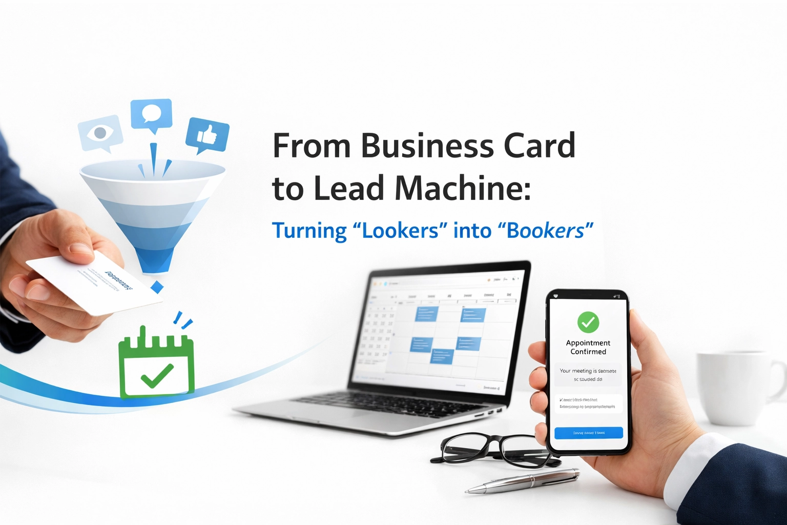
From Lookers to Bookers: Engineering the Lead Machine
A lead machine is not a single feature. It’s the alignment of design, messaging, and flow to make the next step feel obvious and safe.
Your visitors are already busy and distracted. If they need to think too hard about how to engage with you, they will delay—and delay is usually the same as “never.”
Friction-Free Booking Pathways
If a visitor is ready to talk, you must not make them work for it.
Core principles of a friction-free booking path:
- Visible from the start – Your primary CTA (e.g., “Book a Strategy Call”) should be on-screen without scrolling on most devices.
- Clear, specific intent – Replace generic “Contact” with a named outcome (e.g., “Request Your Website Audit”).
- Integrated scheduling – Tools like Calendly or other booking systems allow visitors to pick a time immediately, without the back-and-forth.
- Minimal form fields – Only ask for what you truly need to take the next step.
Each extra click or confusing step is a leak in your pipeline. Close the gaps and the same traffic begins generating more conversations.
Specific Call-to-Actions that Convert
“Contact Us” is not a strategy. It’s a shrug.
High-converting CTAs are:
- Outcome-oriented – “Schedule Your Forensic Website Audit” or “Get a Custom Local Visibility Plan.”
- Time-bound – “Book Your 20-Minute Review” feels lighter and more doable.
- Reassuring – Add microcopy like “No pressure, just insights” to lower perceived risk.
Try replacing vague CTAs with concrete ones in your key sections. Measure the change in clicks and bookings over a month—you’ll often see a meaningful lift without adding a single new page.
Your Website as a 24/7 Sales Engine
A well-engineered website does the quiet work of selling while you sleep. It pre-qualifies leads, answers common questions, and nurtures trust.
Instead of chasing every inquiry, you start attracting better-fit prospects who already understand your value.
Using Social Proof with Intention
Social proof is one of the strongest trust accelerators—but only if it’s curated.
To make testimonials and portfolios work hard for you:
- Select strategically – Highlight stories that mirror your ideal client’s situation.
- Keep it scannable – Use short quotes, bold key phrases, and concise case summaries.
- Pair with visuals – Before-and-after images, project snapshots, or client logos.
- Add context – Include industry, location, and outcome (e.g., “40% increase in qualified inquiries in 3 months”).
Don’t dump every nice word you’ve ever received. Present a focused set of stories that say, “We’ve solved this exact problem for people like you.”
Mobile-First as the Default
For many local businesses, the majority of traffic comes from mobile. That means your mobile experience is not an adaptation—it’s the primary experience.
A mobile-first lead machine ensures:
- Thumb-friendly buttons – Big enough, spaced enough, and in reachable areas.
- Readable typography – No pinching or zooming required.
- Streamlined navigation – Minimal menu items with clear labels.
- Fast load times – Optimized images and lean code.
When your site feels effortless on a smartphone, you keep more visitors, earn more trust, and generate more inquiries.
Data-Driven SEO: Making the Machine Visible
A beautiful, well-structured website that no one finds is a silent asset. Search visibility is the layer that turns your architecture into active opportunity.
Data-driven SEO focuses less on chasing trends and more on aligning with how real people search in your local area.
Intent Over Vanity Metrics
Instead of obsessing over broad, high-volume keywords, prioritize:
- Local intent – “[service] near me,” “[service] in [city],” “[service] for [audience].”
- Problem-based searches – “Why is my website not getting leads?” or “slow website losing customers.”
- Service-specific phrases – Clearly described, not jargon-heavy.
Your goal is not infinite traffic—it’s the right traffic: people in your area, with the problem you solve, ready to act.
Building Signal-Driven Authority
Search engines look for consistent, reinforcing signals:
- Clear page structure (headings, internal links, descriptive URLs)
- Helpful, original content that answers real questions
- Consistent business information across directories and platforms
- Positive engagement signals (time on page, low bounce for key queries)
Think of SEO as the ongoing calibration of your lead machine: adjusting, measuring, and refining so that the right eyes find your site at the right time.
Human-Scale Success: Rethinking the “Agency” Model
Many small businesses have been burned by agencies that overpromise, overcomplicate, and then disappear. What most owners actually want is not hype—it’s clarity, responsiveness, and measurable progress.
A human-scale approach to digital success means:
- Fewer buzzwords, more explanations – You understand what’s being done and why.
- Sustainable improvements – No “growth hacks,” just solid fundamentals.
- Ongoing refinement – Your site evolves with your business, instead of decaying quietly over years.
When your website is treated as a living asset—not a one-time project—you avoid slipping back into “digital business card” territory.
A Measured Transition: From Static to Strategic
If your current site feels like a static relic, you don’t need chaos to fix it. You need a controlled, step-by-step transition.
A measured upgrade usually follows this sequence:
- Audit and diagnose – Where are visitors dropping off? What feels outdated or confusing?
- Clarify positioning – Who is your ideal client? What do they care about most?
- Redesign the spine – Refine layout, hierarchy, and main calls-to-action.
- Tighten messaging – Sharpen your promises, benefits, and proof.
- Integrate booking and follow-up – Make it effortless to schedule with you and receive confirmation.
- Layer in visibility – Strengthen SEO and local presence to feed the machine with the right traffic.
You don’t have to rebuild everything at once. You can move from “card” to “machine” in stages—each one measurable, each one aligned with real business outcomes.
Practical Next Steps You Can Take This Week
You can start improving your website’s performance without a full redesign. Over the next 7 days, try the following:
- Rewrite your primary headline to clearly state who you help and what you help them achieve.
- Replace generic CTAs like “Contact Us” with one specific, outcome-driven action.
- Remove one distraction from your homepage—an extra banner, auto-playing slider, or unnecessary pop-up.
- Test your site on mobile – Fix any obvious issues with readability, buttons, or load time.
- Add one strong testimonial above the fold or near your main CTA, formatted for easy scanning.
Small, focused changes can significantly reduce friction and increase conversions, even before a deeper overhaul.
Conclusion: Your Website Should Work as Hard as You Do
Your business is not generic. Your website shouldn’t be either. A digital business card introduces you and then waits. A lead machine actively builds trust, reduces hesitation, and guides visitors toward a clear, confident “yes.”
The transition from lookers to bookers is not magic. It’s engineering—of layout, language, credibility, and flow. When each piece is tuned, your website becomes a 24/7 asset instead of a passive cost.
If your current site feels static, cluttered, or underperforming, consider it an invitation—not a failure. With a calm, data-informed review and a measured plan, you can build a digital presence that matches the true value of your work.
The next step is simple: examine where the friction lives, then design it out of existence. From there, every visit has a better chance to become what you really want: a real conversation, a real client, a real result.