Speed is a love language.
On mobile, it’s also a business strategy. A fast site signals that you respect your visitor’s time and attention. A slow one quietly tells them to go elsewhere—usually to a competitor who loads in under three seconds.
If you’re a small business owner, especially in a local service market (law, medical, home services, consulting), a sluggish mobile site is more than an annoyance. It’s lost calls, lost inquiries, and lost trust before your message ever has a chance to land.
This guide breaks down how to fix a slow website on mobile using three levers you can control: Distilled Imagery, Ordered Sequences, and Structural Persistence. Think of it as moving from a DIY patchwork to a calm, engineered experience.
First, Confirm: Is Your Mobile Site Actually Slow?
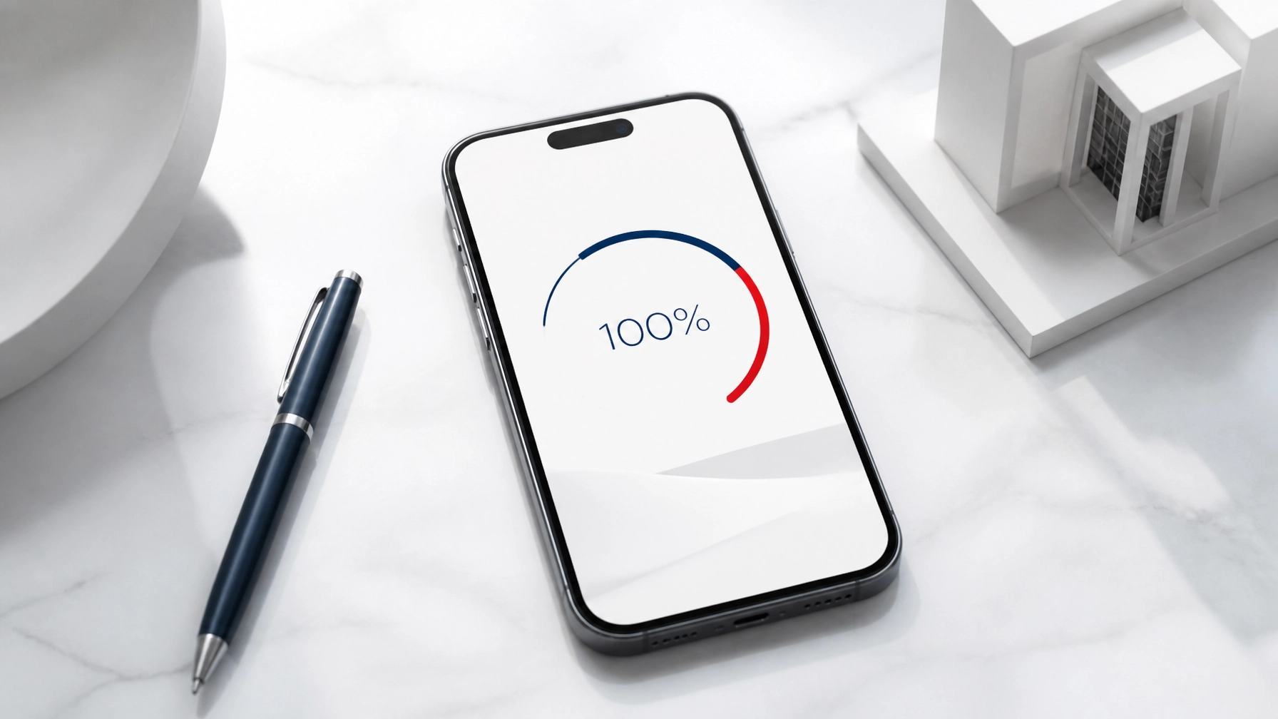
Before you change anything, measure.
Use these free tools to understand how your site performs on real mobile devices:
- Google PageSpeed Insights – Paste your URL, select Mobile, and get specific recommendations.
- GTmetrix – Helpful waterfall view of what loads first and what’s slowing you down.
- Your own phone – Load your site over regular 4G/5G (not Wi‑Fi). If it feels slow to you, it’s slower for your visitors.
Pay particular attention to:
- Largest Contentful Paint (LCP) – How long the main content takes to appear.
- First Input Delay (FID) or Interaction to Next Paint (INP) – How responsive the site feels when tapped.
- Total Page Size – The overall weight in MB.
Once you’ve confirmed there’s friction, you can address it surgically instead of guessing.
Approach 1: Distilled Imagery (Fixing Heavy Images)
Images are often the single biggest cause of slow mobile sites.
Uploading raw photos from a DSLR or stock site can easily add 3–10 MB per image. On a mobile connection, that’s like asking someone to load your brochure over a garden hose.
Step 1: Identify the Worst Offenders
Start with a simple forensic review:
- Run your home page through PageSpeed Insights.
- Look for warnings like “Properly size images” or “Serve images in next-gen formats.”
- Note which images are flagged and on which pages.
These are your heaviest assets—the first place to win back speed.
Step 2: Resize Images to Their Real Display Size
If an image only ever appears at 800px wide on mobile, serving a 4000px image is pure waste.
Actionable steps:
- Export hero images around 1200–1600px wide (not 4000+).
- Export content images (within blog posts, galleries, etc.) around 800–1200px wide.
- For logos and icons, use SVG where possible—they’re lightweight and scale cleanly.
Most design tools (Canva, Figma, Photoshop) and CMS platforms let you set export sizes. Use them intentionally.
Step 3: Use Modern Formats (WebP)
WebP typically offers 25–35% smaller file sizes than JPEG/PNG with similar visual quality.
How to implement it:
- Use an image optimization tool or plugin (for WordPress, tools like Imagify, ShortPixel, or Smush work well).
- Enable automatic WebP conversion where available.
- Keep a fallback (e.g., JPEG) if your platform requires it, but serve WebP first for modern browsers.
If you don’t manage your site’s tech stack personally, ask your developer or agency one focused question:
“Are our images being served as WebP with proper compression for mobile?”
If the answer is no or uncertain, that’s a clear opportunity.
Step 4: Turn on Lazy Loading
Lazy loading means images are only loaded when a visitor is about to see them. This keeps your above-the-fold content light and quick.
Implementation options:
- On modern sites, simply adding
loading="lazy" to <img> tags often works. - Many platforms (WordPress, Webflow, Squarespace) now include lazy loading by default—but confirm it’s actually enabled.
This is especially important if you have:
- Long blog posts with many images
- Portfolios or galleries
- Testimonials with headshots
The result: the page feels fast because the first view loads quickly, even if the full page is image-heavy.
Approach 2: Ordered Sequences (Taming Render-Blocking Scripts)
Your site isn’t just pictures and text. It’s a sequence of instructions—analytics scripts, chat widgets, booking systems, forms, fonts, and more.
On mobile, the order in which these run matters. If everything demands attention at once, the browser stalls, and your visitor stares at a blank screen.
Step 1: Audit What’s Running on Your Site
Look for:
- Multiple analytics trackers (Google Analytics, Facebook Pixel, LinkedIn Insight Tag, etc.)
- Live chat widgets
- Pop-up tools and marketing overlays
- Fancy fonts and icon libraries (e.g., multiple weights of the same font)
Use PageSpeed Insights or your browser’s Developer Tools → Network tab to see how many scripts are loading and how large they are.
The goal isn’t to remove everything. It’s to sequence what actually matters first.
Step 2: Defer Non-Essential Scripts
Anything that doesn’t need to run before the user sees your content should load later.
Examples of scripts to defer:
- Analytics and tracking pixels
- Marketing automation tools
- Chat widgets
- Heatmaps and session recorders
Technical approaches (for your developer or platform admin):
- Use the
defer or async attributes in <script> tags where appropriate. - Load secondary scripts after the main content has rendered.
- Consider tag managers (like Google Tag Manager) configured to fire events after page load, not before.
A practical question to guide choices:
“Does this script help the visitor right now, or does it help us later?”
If it’s the latter, it can almost always be deferred.
Step 3: Minify and Combine Files Where Possible
Minification removes unnecessary characters from code—spaces, comments, and line breaks—without changing behavior.
Benefits:
- Smaller files
- Fewer requests
- Faster downloads on mobile
Ask your developer or hosting provider to:
- Minify CSS and JavaScript.
- Combine smaller files where it doesn’t break functionality (many tools handle this safely).
Many managed hosting platforms and performance plugins offer one-click minification. Test after enabling to ensure nothing breaks visually.
Step 4: Deliver Critical CSS First
Critical CSS is the minimum styling required to render the first screen (header, hero section, basic layout).
Why it matters:
- The browser can paint something meaningful quickly.
- The page feels alive, not frozen.
Practically, this is most often handled by:
- Your theme/framework (some modern themes have built-in critical CSS tools).
- Performance plugins or hosting-level optimization.
You don’t have to write this by hand. But you should ask:
“Is our site using critical CSS or similar techniques to speed up first render on mobile?”
When scripts and styles are ordered correctly, your site doesn’t “pop in” all at once. It unfolds smoothly, like a well-choreographed presentation.
Approach 3: Structural Persistence (Leveraging Caching)
Caching is how your website remembers.
Without caching, every visit is treated like the first visit. The browser re-downloads your logo, fonts, navigation, and layout on every page load.
With caching, the browser keeps a copy of static files so that returning visitors experience your site almost instantly.
Step 1: Enable Browser Caching
Browser caching tells a visitor’s device how long to keep certain files.
Key assets to cache:
- Logos and images
- CSS files
- JavaScript files
- Font files
Typical caching durations:
- Static assets (logos, icons, fonts): weeks to months
- Theme scripts and styles: days to weeks
If you’re on a managed platform (Shopify, Squarespace, many SaaS website builders), much of this is automatic. Still, you can often:
- Set custom cache-control headers at the hosting level.
- Ask support to confirm caching is properly configured for static assets.
If you manage your own server or use WordPress:
- Use a performance plugin (e.g., WP Rocket, W3 Total Cache, or LiteSpeed Cache).
- Confirm that browser caching is enabled and configured.
Step 2: Use a Content Delivery Network (CDN)
A CDN distributes your site’s assets across servers around the world. Instead of every visitor hitting a single server, they’re routed to the nearest location.
Benefits for mobile visitors:
- Shorter physical distance for data to travel
- Lower latency
- More consistent performance, even during traffic spikes
Options:
- Many hosts include a CDN (e.g., via Cloudflare, Fastly, or their own network).
- If not, Cloudflare’s free plan is often a strong starting point.
Ask your host:
“Is our site using a CDN for images, CSS, and JavaScript? If not, what’s the simplest way to enable it?”
Step 3: Optimize Server Response Time (TTFB)
Time to First Byte (TTFB) measures how long it takes for your server to start responding.
If everything else is optimized but your TTFB is slow, your pages still feel sluggish.
To improve TTFB:
- Choose high-quality, performance-focused hosting (avoid the cheapest shared plans if your site is mission-critical).
- Remove unnecessary plugins or apps that add heavy server-side processing.
- Ensure your database (for CMS like WordPress) is regularly cleaned and optimized.
Think of this as the difference between an underpowered engine and a tuned one. The design might look identical, but the feel is completely different.
A Simple Action Plan You Can Execute This Month
To make this concrete, here’s a prioritized checklist you can work through or hand to your developer:
Week 1: Measure and Identify
- Run your home page and top landing pages through PageSpeed Insights (mobile).
- Note your LCP, total page size, and the list of recommended fixes.
- Identify the heaviest images and the most frequent third-party scripts.
Week 2: Fix Images (Distilled Imagery)
- Resize oversized images to realistic display sizes.
- Convert and serve images in WebP where possible.
- Ensure lazy loading is enabled for images below the fold.
Week 3: Reorder Scripts (Ordered Sequences)
- Defer analytics, chat widgets, and marketing scripts.
- Minify CSS and JavaScript files.
- Confirm your theme or platform supports (and uses) critical CSS or equivalent.
Week 4: Lock In Caching (Structural Persistence)
- Enable browser caching for static assets.
- Turn on a CDN through your host or a provider like Cloudflare.
- Re-run performance tests and note improvements in mobile load times.
This doesn’t require a full redesign. It’s an architectural refinement of what you already have.
How to Know It’s Working (Beyond Scores)
Performance tools are helpful, but your visitors don’t see scores—they feel experiences.
Watch for:
- Shorter wait before content appears on a mobile phone.
- Less “jumping” or stuttering as the page loads.
- Higher engagement: more form submissions, calls, or time on key pages.
Ask recent clients how they found your site experience:
- “Did the site load quickly on your phone?”
- “Was anything slow or frustrating to use?”
Simple, honest feedback often reveals gaps that metrics miss.
When You Need a Forensic Review (Not Just Tweaks)
Sometimes, a site is slow because of deep structural choices—a bloated theme, too many plugins, or a patchwork of tools added over time.
In those cases, surface-level changes help, but they don’t unlock the full potential. You may need a forensic review: a structured, professional look at your site’s performance, UX/UI, and mobile architecture.
What a forensic review typically includes:
- Detailed load-time breakdowns (what’s slowing which pages)
- Image, script, and font optimization opportunities
- Caching and CDN configuration checks
- Practical recommendations ordered by impact and difficulty
The outcome is clarity: you know which specific “weights” are slowing you down and what to adjust first.
Bringing It All Together: From Noise to Signal
A fast mobile site does more than pass a technical checklist. It changes how your brand feels.
- Distilled Imagery removes visual weight so your message can breathe.
- Ordered Sequences ensure your site unfolds with intention instead of stuttering into view.
- Structural Persistence lets returning visitors experience that same composure, instantly.
When these three levers work together, speed becomes invisible—but deeply felt. Visitors don’t think, “This site is fast.” They think, “This feels easy. I trust this.”
If your website isn’t converting the way it should, look first at the invisible friction of load time. Remove the weight, restore the tempo, and let your expertise be the signal—not your page speed.
Contact SiteGooRoo for assistance - we can help!