The last 72 hours have been unusually revealing for both SEOs and web designers. We’re seeing Google double down on proprietary assets, UX teams pivot toward Agentic interfaces, and layout trends like Bento grids move from aesthetic experiments to performance levers. This briefing unpacks what changed and how to translate signal into action this week.
1. Proprietary Assets Are Becoming a Core Ranking Edge
The latest post–March 2026 Core Update analysis shows that over 90% of winning sites have one thing in common: proprietary assets—data, tools, visuals, or frameworks that no one else has.
What “proprietary assets” really mean in practice
Think beyond blog posts and category pages. Google is favoring:
- Original datasets: surveys, benchmarks, internal product usage data, or anonymized customer insights
- Custom studies and experiments: A/B test findings, UX research summaries, or performance studies
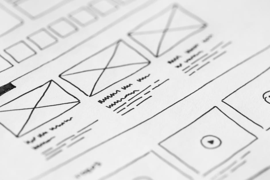
- Original imagery and media: unique diagrams, product photos, flows, and conceptual visuals rather than stock
- Owned frameworks and models: your own methodologies, naming conventions, canvases, and scorecards
Curated roundups and generic how‑to guides are losing ground to pages that act as sources, not just summaries.
How to operationalize this in your org
Inventory what you already own
- Product metrics (usage, time‑to‑value, feature adoption)
- Support data (most common tickets, time to resolution)
- Sales intel (objection patterns, win/loss reasons)
- Research (NPS comments, UX studies, user interviews)
Elevate 3–5 standout assets into flagship content
- Turn a dataset into an annual industry report or benchmark index.
- Summarize UX findings into a playbook with visuals and templates.
- Convert internal tools into public calculators or estimators.
Make it unmistakably yours
- Watermark key charts with brand + year.
- Embed “methodology” sections that clarify your process.
- Use internal naming: when Google sees others referencing your terms, it strengthens your authority.
Action for this week: Schedule a 60‑minute cross‑team workshop (Product, CS, Marketing) with one question: “What do we know or own that nobody else does?” Use that list as your 2026 content roadmap.
2. Task Completion Is Quietly Becoming a Ranking Signal
Recent data shows more than 80% of high‑ranking pages are optimized around task completion, not just information delivery. Google’s behavior suggests it’s rewarding pages where users can finish what they came to do—without pogo‑sticking across tabs.
What counts as “task completion”?
Depending on your business, the primary task may be:
- Booking a meeting or demo
- Calculating a cost, ROI, or timeline
- Completing a purchase or subscription
- Generating a personalized plan, checklist, or template
- Submitting a detailed quote or configuration request
How to redesign pages for completion, not just clicks
Identify the primary task per page
Decide: If this page succeeds, what did the user complete? That should drive layout and content hierarchy.
Surface the action within the first viewport
- Place calculators, forms, and key CTAs above the fold.
- Use contrast, white space, and microcopy to draw attention to the task.
Reduce friction ruthlessly
- Cut form fields to the minimum required.
- Offer passwordless or social sign‑in when account creation is needed.
- Use progress indicators on multi‑step flows.
Measure task completion as a core KPI
Track: completed forms, calculator uses, downloads, bookings—per landing URL. Treat “task completion rate” like a north‑star metric for SEO + UX.
Task check for this week: Choose three top‑traffic pages and ask: “Can a user complete their goal in under three clicks or taps?” If not, simplify.
3. Mobile‑First Indexing 2.0 and the 15% Visibility Gap
Sites aligned with the 2026 Mobile UX Standards are now seeing an average 15% visibility lift over those still using 2024-era responsive templates. The gap is no longer about just being mobile‑friendly—it's about being mobile‑native.
What defines “2026‑ready” mobile UX?
- Ultra‑fast performance: LCP under ~1.8s on 4G, low TBT, and minimal layout shifts.
- Thumb‑friendly interaction: main controls within comfortable reach zones on mid‑sized devices.
- Intent‑focused layouts: fewer, more focused modules per screen rather than compressed desktop clones.
- Reduced cognitive load: clear visual hierarchy, fewer distractions, strong affordances.
Implementation priorities
Design mobile first, not last
Start wireframing on a 375–430px canvas and scale upward. Desktop becomes the enhancement layer, not the starting point.
Refactor navigation for thumbs
- Sticky bottom nav bars with 3–5 core actions.
- Large hit targets (44–48px minimum).
- Avoid top‑left hamburger menus as the sole nav pattern.
Strip non‑essential scripts
Audit every script for impact versus value. Defer, lazy‑load, or replace heavy libraries with lighter alternatives.
Audit idea for this week: Run your top 10 URLs through PageSpeed Insights using a mid‑tier mobile device profile. Prioritize fixes for LCP elements and blocking scripts.
4. AI Overviews and the Age of Citation SEO
AI Overviews (AIO) now appear in roughly 48% of SERPs, and the overlap between traditional rankings and AIO citations is tightening—especially in regulated spaces like healthcare.
What “Citation SEO” looks like in 2026
To be cited by AI Overviews, your content needs to:
- Be factually tight: well‑sourced, up‑to‑date, and medically or legally reviewed if relevant.
- Use clear, structured language: headings, lists, and concise definitions are easier to parse.
- Show topical depth: cover adjacent questions and edge cases, not just the primary query.
- Demonstrate authority off‑site: recognized experts, reputable backlinks, and consistent entity signals.
Practical steps to become “AIO‑worthy”
Build topic‑complete hubs
Create hub pages that answer the main query and its most common follow‑ups. Think in terms of clusters, not isolated articles.
Add clear citations and evidence
- Link to primary studies, standards, and regulations.
- Date‑stamp updates and call out what changed.
Strengthen entity alignment
Ensure consistent use of names, credentials, and organizations across your site and profiles. Structured data (schema) helps reinforce this.
Action for this week: Pick one revenue‑critical topic and turn its main page into a “citation‑grade” hub: structured headings, definitions, FAQs, and clearly cited sources.
5. Bento Grid Layouts Move From Trend to Standard
“Bento Box” layouts—grids of modular cards combining imagery, data, and copy—are now a common sight on high‑density, content‑rich pages. They’re no longer just a design flex; used well, they clarify complexity and support task completion.
Why Bento works in 2026
- Scannability: Users can quickly parse categories or actions from distinct modules.
- Flexibility: Cards can mix media—video, stats, text, forms—without visual chaos.
- Responsiveness: Grids adapt gracefully across breakpoints with consistent rhythm.
Where to apply Bento grids
- Product overview pages (segmenting use cases or industries)
- Feature hubs (each module is a feature + benefit + CTA)
- Learning centers (grouped by level, topic, or job‑to‑be‑done)
- Pricing and packaging (modules for tiers, add‑ons, or bundles)
Implementation tips
Anchor each card to a single decision or task
A card should answer: What is this? Who is it for? What’s the next action?
Use hierarchy within the grid
Vary card size and emphasis for primary versus secondary modules instead of treating all cards as equals.
Avoid visual noise
Limit color variation, use consistent spacing, and keep typography systems tight.
Quick win for this week: If your homepage feels cluttered, redesign the hero + first scroll as a Bento grid of 4–6 key paths instead of one long slab of content.
6. From Human‑Centered to Agentic UX
A visible shift is underway from classic “human‑centered” flows (forms, filters, step‑by‑step wizards) to Agentic UX—interfaces where AI agents act on behalf of users.
Instead of designing only for manual input, teams are designing spaces where an agent:
- Anticipates intent from behavior and context
- Negotiates options (pricing, configurations, content) on the user’s behalf
- Summarizes choices and trade‑offs in human‑friendly terms
What changes for designers
The designer’s role evolves from path‑builder to trust‑builder:
- Transparency by design: clear explanations of what the agent sees, uses, and does.
- Control affordances: easy ways to override, correct, or constrain the agent.
- Escalation paths: smooth transitions from AI to human support when needed.
Designing an Agentic flow in 4 steps
Define the user’s real job‑to‑be‑done
Instead of “fill out a form,” consider “get a reliable quote I can justify internally.”
Map what the agent can responsibly handle
Identify which decisions the agent can automate (e.g., pre‑filling data) and which must stay user‑controlled.
Design the conversation layer
Focus on prompts, confirmations, and explanations. Clarity here is more important than visual flair.
Guardrails and consent
Offer clear toggles for data sharing, personalization, and autopilot behavior.
Experiment for this week: Take one multi‑step form (e.g., quote, onboarding, application) and imagine it as a conversation with an agent. Sketch how the agent could ask, pre‑fill, and summarize instead of forcing users through rigid steps.
7. Kinetic Typography as a UX Instrument
Kinetic typography—text that moves or reacts to interaction—is escalating from decorative animation to a guidance tool. Sites are using motion to gently steer attention toward CTAs and key copy.
Principles for using motion without overload
- Purpose first: Every movement should point to hierarchy, state change, or feedback—not just “wow factor.”
- Subtlety over spectacle: Small shifts, fades, and micro‑interactions are usually more effective than large, sweeping animations.
- Performance awareness: Heavy animation libraries can destroy the very metrics you’re trying to improve.
Practical use cases
- Highlighting a primary CTA as the user scrolls past key proof sections.
- Emphasizing changes in pricing, discounts, or availability.
- Drawing attention to inline validation messages or critical warnings.
Design exercise for this week: Audit animated text on your site. For each instance, answer: What behavior is this animation encouraging? If the answer is “none,” simplify or remove it.
8. Green UX: Sustainability as a Technical Requirement
“Green UX” has moved beyond brand messaging into a technical and SEO consideration. Lean interfaces now pull double duty: they reduce energy use and improve performance.
Key Green UX practices
- Lightweight UI components: fewer, smaller assets; SVGs over heavy imagery where possible.
- Dark mode optimized for OLED: true blacks and high contrast to reduce screen power draw.
- Script‑shaving and bundling: fewer round trips, less JS to parse and execute.
- Smarter media loading: responsive images, lazy loading below‑the‑fold elements.
Why this matters for SEO
- Faster LCP and better Core Web Vitals.
- Higher user satisfaction and lower bounce rates.
- Stronger alignment with corporate ESG narratives and procurement criteria.
Optimization idea for this week: Pick one heavy template (e.g., blog post, product page) and aim to cut page weight by 30% via image optimization, script reduction, and CSS cleanup.
9. Gemini in Chrome and the Fragmented Search Journey
Expanded Gemini integration in Chrome means searches are now influenced by personal context from connected Google apps. Search is becoming more:
- Personalized: queries and suggestions reflect individual histories and preferences.
- Fragmented: two users with the same query see diverging paths.
- Private: more of the decision path happens inside personal assistants and sidebars.
Implications for SEO and content
- Fewer predictable, linear funnels; more multi‑touch, cross‑channel journeys.
- Greater importance of brand recall: showing up once isn’t enough; you need to be memorable.
- Need for experience continuity: aligning messaging and design across web, email, and in‑product surfaces.
Focus for this week: Review your messaging consistency across your homepage, key landing pages, and onboarding flows. The more fragmented search becomes, the more consistency becomes a competitive moat.
10. AI‑Proofing the Web Design Career
A new Tufts report suggests around 38% of roles are currently “AI‑proof”, with execution‑heavy tasks most at risk. For web designers and UX practitioners, the path forward is clear: move up the value chain.
Skills that age well in an AI‑heavy world
- Problem framing and strategy: defining the right problems and constraints.
- Information architecture and systems thinking: designing structures, not just screens.
- Research and synthesis: making sense of qualitative and quantitative signals.
- Emotional resonance: crafting narratives and interactions that feel human, trustworthy, and on‑brand.
How to reposition yourself
Shift your portfolio from “what I made” to “what I changed”
Highlight business outcomes, not just visuals: conversion lifts, reduced drop‑off, faster onboarding.
Learn to direct AI, not compete with it
Treat generative tools as junior collaborators. Your edge is judgment and taste.
Co‑own metrics with product and marketing
Become the person who asks: “How are we measuring success for this experience?”
Career action for this week: Choose one current project and add a slide or section labeled “Impact & Learning”—what changed for users and the business as a result of your design.
Weekly Action Checklist
Use this as a quick implementation list for the next 7 days:
- Audit your proprietary assets and decide on one flagship report, tool, or dataset to develop.
- Run a task‑completion review on your top 3 landing pages.
- Test mobile performance and thumb‑friendliness on key flows.
- Upgrade one topic into a citation‑grade hub for AI Overviews.
- Explore a Bento grid refresh for your homepage or product overview.
- Prototype an Agentic UX variation of a form‑heavy flow.
- Trim animations and scripts that don’t serve a clear UX purpose.
- Implement one Green UX optimization on a high‑traffic template.
Focus on momentum, not perfection. Even one or two targeted improvements each week will compound into a meaningful edge as 2026’s algorithms and interfaces continue to evolve.