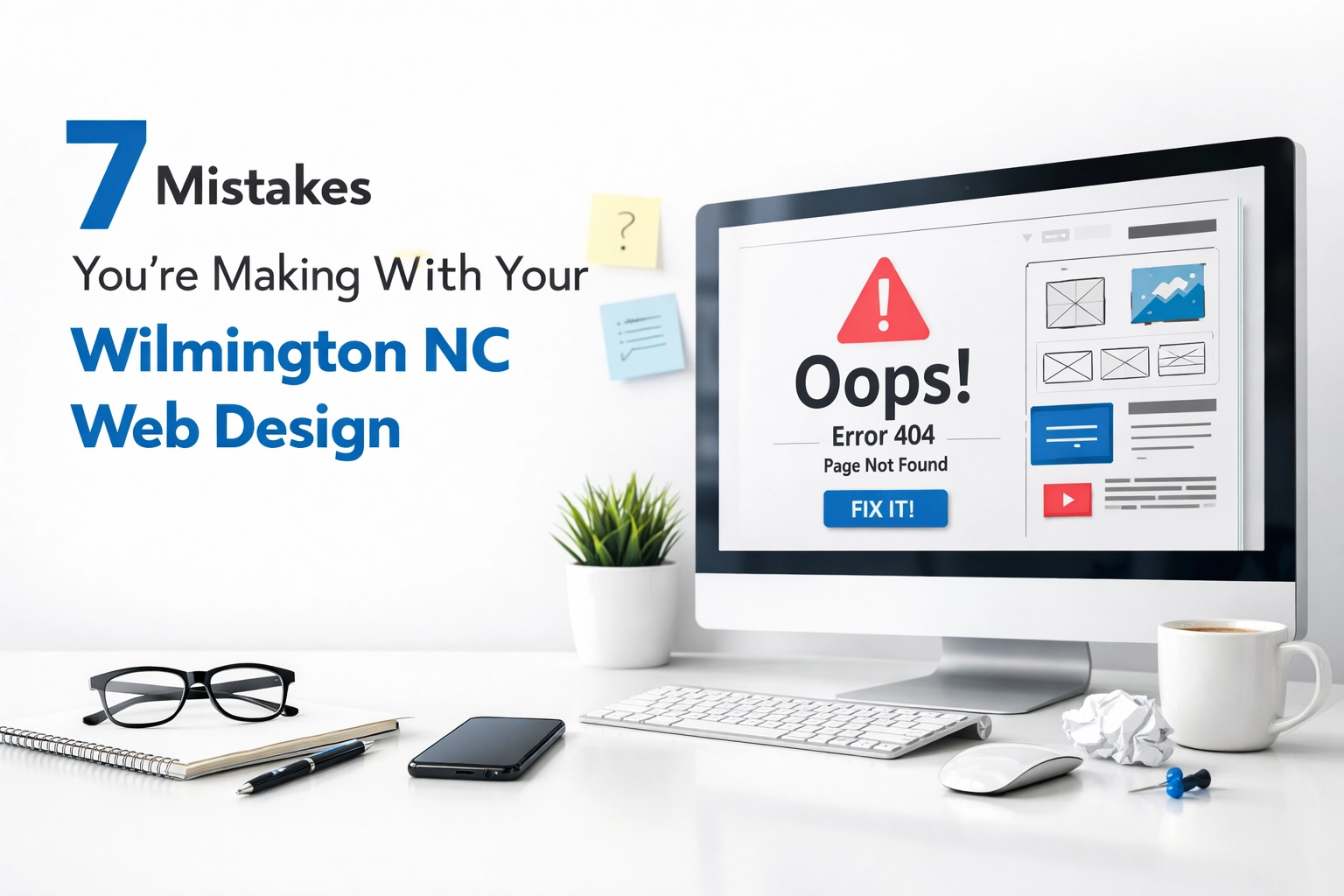
Your website is your most loyal employee. It shows up 24/7, never asks for time off, and is often the first interaction a potential customer has with your Wilmington, NC business. Yet for many local brands, this “digital employee” is underperforming—slow, confusing, or visually exhausting.
In a city that balances seasonal tourism with year-round professional services, your website can’t just exist; it has to work. Below is a forensic look at seven structural mistakes common in Wilmington NC web design—and how to correct them with intention.
1. The Labyrinth: Navigational Friction
When visitors land on your site, they instinctively search for the path of least resistance. If your navigation feels like a maze, they’ll exit rather than explore.
Common symptoms:
- Overcrowded top menus with 8–10+ items
- Services buried in dropdowns or secondary pages
- Contact information hidden in the footer only
- Inconsistent labels like “Solutions” or “Resources” that mean nothing to a first-time visitor
How to Fix It
Think of navigation as your website’s spine—it should be minimal, stable, and intuitive.
- Limit your primary menu to 5–7 core items
- Use clear, literal labels like “Services,” “About,” “Portfolio,” and “Contact”
- Add a persistent contact or “Start Your Project” button in the header
- Ensure every page has a clear next step (CTA, related services, or contact prompt)
Expected Outcome
- Reduced bounce rates as visitors quickly find what they need
- More page views per session
- A clear, frictionless path from curiosity to contact form
2. The Static Screen: Ignoring Mobile Precision
Wilmington is effectively a mobile-first environment. Tourists on the Riverwalk, professionals between meetings, and residents searching “web design Wilmington NC” are all browsing from their phones.
If your site only “looks right” on desktop, you’re quietly turning away a large percentage of potential leads.
Common symptoms:
- Users forced to pinch and zoom to read text
- Buttons that are too small to tap with a thumb
- Misaligned sections or overlapping text on phones
- Slow, clunky mobile load times
How to Fix It
Responsive design is no longer optional—it’s the baseline.
- Use a mobile-first layout: design for the smallest screen, then scale up
- Ensure tap targets are large enough (at least 44x44px)
- Test across devices (iPhone, Android, tablets) instead of assuming your theme “handles it”
- Prioritize key actions above the fold on mobile—call, directions, or “Request a Quote”
Expected Outcome
- Higher engagement from mobile visitors
- Better user experience for tourists and locals on the go
- Stronger rankings as Google prioritizes mobile-friendly sites
3. The Visual Noise: Walls of Text
In an effort to sound authoritative, many Wilmington businesses overload pages with dense paragraphs and technical jargon. The intention is good; the execution is exhausting.
Walls of text don’t make you look more professional—they make you easier to abandon.
Common symptoms:
- Paragraphs running 8–10 lines or more
- No subheadings, bullet points, or visual breaks
- Key benefits hidden inside long, unfocused copy
How to Fix It
Adopt a “white-cube gallery” approach to your content: fewer elements, clearly framed.
- Break copy into short paragraphs (2–4 sentences)
- Use descriptive subheadings so scanners can find what matters
- Leverage bullet points for benefits, services, and differentiators
- Highlight key phrases in bold to guide the eye
Example transformation:
Instead of a 300-word block about your services, organize into:
- Who you serve in Wilmington and nearby areas
- What specific problems you solve
- Why your approach is different
- How to start (CTA)
Expected Outcome
- Higher on-page engagement and scroll depth
- Visitors who feel informed, not overwhelmed
- A more polished, editorial look that signals expertise
4. The Ghost Town: Performance Lag
Speed is the difference between a site that quietly converts and one that silently leaks revenue. A one-second delay can meaningfully reduce your conversion rate—and many local sites are far slower than that.
Common symptoms:
- Hero images that take several seconds to load
- Scripts and plugins stacked from years of quick fixes
- Sluggish page transitions, especially on mobile data
How to Fix It
Think of performance as tuning a high-value piece of machinery.
- Compress and properly size images before uploading
- Use next-gen formats like WebP where possible
- Minify CSS and JavaScript and remove unused scripts
- Enable browser caching and a CDN if you serve a wider region beyond Wilmington
- Audit plugins and remove anything non-essential
Expected Outcome
- Faster load times that respect user attention
- Better SEO performance (page speed is a ranking factor)
- A quieter, smoother user experience that feels premium
5. The Ambiguous Intent: Weak Calls to Action
A website without clear direction is just a digital brochure. It may look nice, but it doesn’t drive business.
If your visitors don’t know what you want them to do next, they won’t guess.
Common symptoms:
- Vague buttons like “Learn More” or “Submit” everywhere
- Contact forms hidden at the bottom of long pages
- No obvious path for different user types (tourists vs. local businesses, for example)
How to Fix It
Treat every page like a conversation that needs a next step.
- Use specific CTAs: “Start Your Project,” “Request a Free Website Audit,” “Schedule a Consultation”
- Match CTAs to intent: educational pages might lead to “Download the Guide,” service pages to “Book a Call”
- Place primary CTAs above the fold and repeat them strategically down the page
- Use contrasting button colors that align with your brand but stand out visually
Expected Outcome
- Clear pathways from visitor to lead
- Higher form submissions and phone calls
- Analytics that reveal which calls to action perform best
6. Brand Drift: Visual Inconsistency
Your website should feel like a seamless extension of your physical presence and customer experience in Wilmington. When it doesn’t, trust erodes quietly.
Common symptoms:
- Different fonts used on different pages
- Inconsistent button shapes, colors, and hover states
- A logo that looks crisp on desktop but blurry on mobile
- Stock photos that don’t align with your real-world brand
How to Fix It
Establish a visual tempo and stick to it.
- Create a simple brand style guide: colors, fonts, button styles, and spacing rules
- Limit your color palette to 2–3 core colors plus neutrals
- Use one or two typefaces site-wide with clear hierarchy (H1, H2, body)
- Choose photography that reflects Wilmington (coastal light, local architecture, your actual team)
Expected Outcome
- A refined, cohesive presence that feels intentional
- Stronger brand recognition online and offline
- Increased trust from visitors who sense professionalism instantly
7. The Hidden Asset: Neglecting Local SEO
A visually stunning site is useless if no one in Wilmington can find it. Local SEO is how your digital employee shows up for work when someone searches for what you offer.
Common symptoms:
- No mention of “Wilmington, NC” or nearby areas in your core pages
- Missing or incomplete Google Business Profile
- Inconsistent business name, address, and phone number across directories
- No location-based service pages (e.g., “web design services in Wilmington NC”)
How to Fix It
Focus on search intent, not keyword stuffing.
- Integrate local phrases naturally: “web design in Wilmington NC,” “Wilmington small business website,” etc.
- Optimize your Google Business Profile with accurate categories, hours, and photos
- Encourage reviews from real local clients and respond to them
- Create location-focused content: case studies, project highlights, or guides tied to Wilmington and nearby coastal areas
Expected Outcome
- Higher visibility in local search results and map packs
- More qualified, geographically relevant traffic
- A steady pipeline of inquiries from people already looking for what you do
Auditing the Invisible: Is Your Site Structurally Sound?
Most business owners see only the surface of their website—the hero image, the copy, the colors. The real performance, however, depends on the invisible structure beneath: navigation logic, technical health, and the clarity of your messaging.
A focused website design audit is often the most efficient first step. It reveals:
- Where visitors are silently dropping off
- Which pages are confusing, redundant, or unnecessary
- What technical issues are slowing you down
- How your CTAs and content are performing in real terms
If your digital employee isn’t meeting expectations, an audit gives you a prioritized roadmap instead of a guess.
Moving Toward Digital Composure
In Wilmington’s competitive environment, quiet sophistication wins. The most effective websites aren’t always the flashiest—they’re the ones that remove friction, communicate clearly, and guide visitors toward precise, human-centered outcomes.
By correcting these seven common mistakes, you turn your site from a liability into a leveraged asset: a composed, high-performing presence that represents your business faithfully, day and night.
If you’re ready for a forensic review of your current website and want a more measured, strategic approach to your digital presence, start with a structured website design audit. It’s the fastest way to ensure your 24/7 employee is finally working with intent—and working for you, not against you.