Wilmington is a landscape defined by rhythm.
The tide at Wrightsville Beach. The flow of traffic on Market Street. The seasonal pulse of the Riverfront.
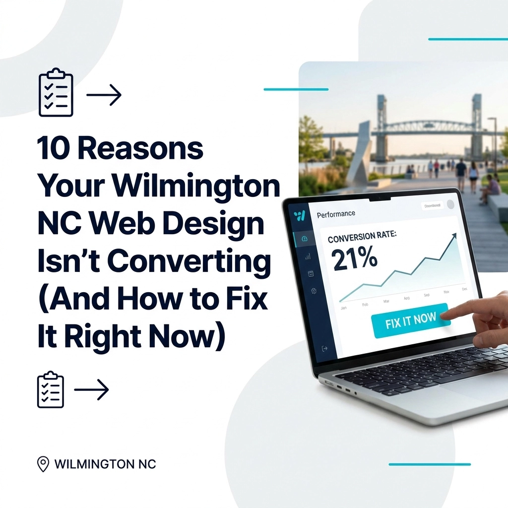
Your business exists within this rhythm. But does your website?
If your traffic is solid but your phone isn’t ringing, you don’t have a visibility problem—you have a conversion problem. Conversion is not an accident. It is engineered.
Below are 10 reasons your current small business website design in Wilmington, NC is failing to convert, and the concrete steps you can take to fix it right now.
1. The Mobile Friction Point
Most of your local customers are searching while on the move.
They’re looking for a lawyer while waiting for coffee off Oleander. They’re searching for a doctor while parked at Mayfaire. They’re hunting for a roofer after a storm rolls in from the Intracoastal.
If your site isn’t flawlessly responsive, you’re asking them to work. Pinch-to-zoom, tiny tap targets, and broken layouts create friction.
Friction leads to abandonment.
How to Fix It
- Adopt a mobile-first architecture: Design for the phone screen before the desktop.
- Use “thumb-friendly” buttons: Make primary CTAs at least 44x44px and place them where thumbs naturally rest.
- Enforce legible typography: Minimum 16px base font size; avoid dense blocks of text.
- Test on real devices: iPhone, Android, older phones, different browsers—not just a desktop simulator.
A seamless transition between devices is the baseline for modern web design services in Wilmington, NC. Anything less costs you calls and form submissions.
2. Excessive Visual Noise
Many websites suffer from what can only be called “clutter-core.”
Too many banners. Conflicting colors. Pop-ups on top of sliders on top of chat widgets. When everything screams for attention, nothing is heard.
Think of your website as a white-cube art gallery: every element should have room to breathe and a clear role.
How to Fix It
- Embrace whitespace: Space is not “empty”; it’s a design tool that guides the eye and reduces cognitive load.
- Limit your color palette: 1–2 primary brand colors, plus 1 neutral. Avoid neon chaos.
- Establish visual hierarchy: One main CTA per screen, with supporting actions secondary.
- Remove non-essential elements: If a block doesn’t move a user closer to a decision, consider cutting it.
Calm design signals competence. In a busy local market, clarity is conversion power.
3. The “Business Card” Stagnation
A website that only lists your services is a digital business card.
It’s passive. It waits for the visitor to do the heavy lifting—figuring out if you understand their problem, if you’ve solved it before, and what happens next.
A high-converting Wilmington small business website behaves like a 24/7 sales engine, not a brochure.
How to Fix It
Shift from information to invitation:
- Lead with the problem you solve: “Tired of flooded crawlspaces in Wilmington storms?” instead of “We offer waterproofing.”
- Show the outcome, not just the tools: Before/after photos, case studies, and clear benefits.
- Create guided pathways: For example, “I need an emergency plumber” vs. “I’m planning a renovation” with separate flows.
- Use benefit-driven headlines: “Stop Roof Leaks in One Visit” is stronger than “Residential Roofing Services.”
Your site should do something for the visitor in the first 5 seconds: clarify, reassure, and direct.
4. Vague Calls-to-Action (CTA)
"Contact Us" is a request for a chore.
"Submit" is a command with no reward.
When your visitor has to guess what happens next, they hesitate. Hesitation kills momentum—and conversions.
How to Fix It
Use specific, value-driven CTAs that complete the sentence “I want to…”
- For local lawyers: “Schedule Your Free Legal Consultation”
- For roofers: “Get Your Same-Day Roof Inspection”
- For med spas: “Claim Your Complimentary Skin Assessment”
- For home services: “Book Your In-Home Estimate in Wilmington”
Best practices:
- Place a primary CTA above the fold on every key page.
- Repeat the CTA in logical spots: after benefits, after testimonials, near pricing.
- Clarify the next step: “We’ll call within 1 business hour,” “You’ll get a detailed quote within 24 hours,” etc.
Clarity reduces anxiety. Reduced anxiety increases form fills and phone calls.
5. Performance Lags and Latency
In 2026, speed is a metric of respect.
A slow site tells the user their time is not valuable. On mobile—especially on spotty service between Carolina Beach and downtown—waiting 8 seconds for a hero image to load is a deal-breaker.
Search engines agree: Google penalizes latency, pushing your Wilmington business further down local search results.
How to Fix It
Treat performance as a design pillar, not an afterthought.
- Optimize visual assets: Use modern formats like WebP and AVIF; compress images without crushing quality.
- Lazy-load non-critical media: Load below-the-fold content as users scroll.
- Minimize heavy scripts: Remove unused plugins, third-party trackers, and bloated themes.
- Use caching and a quality host: Especially if you’re targeting visitors across the Carolinas.
Measure your speed with tools like PageSpeed Insights and GTmetrix, then iterate until your site feels instant.
6. Navigation Complexity
Your menu should not be a puzzle.
When a user lands on a site with fifteen top-level menu items and nested dropdowns, decision paralysis sets in. They shouldn’t have to “explore” to find your phone number, booking form, or address near the Riverfront.
How to Fix It
Simplify the layout spine of your site:
- Limit main navigation: Aim for 5–6 core items (e.g., Home, Services, About, Portfolio/Results, Blog, Contact).
- Use the footer for secondary links: FAQs, policies, careers, resources, etc.
- Make contact obvious: Phone number and “Book Now” or “Get a Quote” visible in the header.
- Highlight the primary path: Use design cues (color, size) to emphasize the main action.
The easier it is to move from curiosity to contact, the higher your conversion rate.
7. The Ghost Town Effect
Content is the engine of digital growth.
If your last blog post was from 2023, your business feels frozen in time. Prospects wonder: Are they still open? Did they survive that last hurricane season? Trust is fragile—and silence erodes it.
How to Fix It
Build a consistent, high-quality content engine:
- Create locally relevant posts: “How Wilmington’s Humidity Impacts Your Roof,” “What New Hanover Homeowners Should Know About Flood Insurance,” etc.
- Update your portfolio regularly: Showcase recent projects in areas like Landfall, Porters Neck, or downtown.
- Share the human side: Team spotlights, community involvement, local partnerships.
- Use content to answer pre-sales questions: Turn common FAQs into articles, guides, or videos.
Fresh, relevant content signals that your business is active, informed, and invested in the community.
8. Absence of Social Proof
People buy from people—specifically, from people that other people already trust.
A Wilmington business website without testimonials, local case studies, or recognizable social proof elements feels anonymous and risky.
How to Fix It
Curate your wins and make them visible:
- Feature local testimonials: “After Hurricane Florence, Coastal Roofing had our Carolina Beach property watertight in 48 hours.”
- Use names and locations: Even just first name + neighborhood: “Sarah, Wrightsville Beach homeowner.”
- Show ratings and reviews: Google, Yelp, Facebook badges where appropriate.
- Highlight logos and partners: Local organizations, HOAs, chambers of commerce.
Ground your social proof in Wilmington itself—landmarks, neighborhoods, local events. This builds E-E-A-T: Experience, Expertise, Authoritativeness, and Trust.
9. Lack of Forensic Data
Are you guessing where people click?
If you aren’t tracking user behavior, you are designing in the dark. You might think your About page is the star, while visitors are actually bouncing from your Services page due to a confusing layout or broken form.
How to Fix It
Turn your website into a measured system instead of a pretty guess.
- Install analytics: Google Analytics 4 or a privacy-friendly alternative.
- Set up conversion tracking: Phone click tracking, form submissions, booking confirmations.
- Use heatmaps and session recordings: Tools like Hotjar or Microsoft Clarity show where users linger and where they flee.
- Run simple A/B tests: Different headlines, button colors, or layouts to see what actually performs.
Data replaces ego. When you can see where your digital funnel leaks, you can patch it and reclaim lost revenue.
10. The Identity Crisis
Does your website look like it was built for a generic company in a generic city?
Wilmington has a specific aesthetic: riverfront brick, coastal light, live oaks, and a laid-back-but-serious business culture. Generic stock photos of people in stiff suits under fluorescent lights don’t resonate in a beach town.
How to Fix It
Build a visual identity that feels both local and professional:
- Invest in custom photography: Your office, your team, your work, your part of town.
- Show real context: A contractor truck parked in a Wilmington neighborhood, a law office near Front Street, a medical practice close to Mayfaire.
- Stay on-brand: Consistent fonts, colors, and tone across pages and platforms.
- Align visuals with your positioning: Are you premium, budget-friendly, boutique, or enterprise-focused? Let your visuals reflect that.
When visitors feel, “These are my people, in my town, solving my problem,” conversion becomes the natural next step.
The Anatomy of a High-Leverage Wilmington Website
High-performing local websites don’t happen by accident. They are engineered around two core concepts:
- Visual tempo – How the eye moves through the page: the rhythm of headlines, images, white space, and CTAs.
- Logic flow – How the mind moves through the decision: problem → proof → solution → next step.
A high-leverage site:
- Greets visitors with a clear, specific promise.
- Demonstrates credibility with real social proof and case studies.
- Removes friction at every step—load time, navigation, messaging.
- Makes the next step obvious, easy, and low-risk.
"Design is not just what it looks like and feels like. Design is how it works." – Steve Jobs
If your website isn’t working for your Wilmington business, it’s working against it.
The shift from a digital business card to a local lead machine is one of the most powerful upgrades you can make to your marketing.
Why Many Local Businesses Prefer an “Anti-Agency” Approach
Traditional agencies often treat you like a ticket number.
You get noisy dashboards, vague promises, and a rotating cast of account managers. The result is rarely a site that feels deeply tuned to your market, your customers, and your goals.
An “anti-agency” approach focuses on:
- One-at-a-time execution: Your project receives focused attention until it’s right.
- Forensic analysis over fluff: Real audits, real recommendations, real implementation.
- Measured, deliberate growth: Iteration based on performance, not vanity metrics.
For Wilmington businesses, this kind of detail-oriented, locally informed approach often outperforms big, generic agency solutions.
Assurance Through Forensic Review
Is your website a high-performance engine—or a digital paperweight?
Most business owners can feel that something is off, but they can’t quite locate the “why.” Is it the copy? The design? The SEO? The page speed? The answer is usually a combination.
A forensic website review looks under the hood:
- SEO: Are you visible for the right Wilmington search terms? Are technical issues holding you back?
- UX/UI: Is the experience intuitive, fast, and reassuring on every device?
- Conversion bottlenecks: Where do users hesitate, stall, or drop off?
Instead of a generic automated PDF, a true audit gives you:
- Prioritized issues (what to fix first, second, third).
- Concrete recommendations (not just “improve content” but how).
- A clear roadmap from “digital business card” to “lead machine.”
Your Next Step: Claim a Strategic Website Audit
If your site is getting traffic but not generating calls, bookings, or consultations, you don’t need more visitors—you need a higher-converting Wilmington-optimized website.
Here’s a simple action plan:
- Review the 10 issues above and note where your site falls short.
- Prioritize your fixes: Start with speed, mobile, CTAs, and navigation.
- Layer in social proof and fresh local content to build authority.
- Back everything with data using analytics and heatmaps.
If you’d like expert eyes on your current site, request a Free Website Design Audit focused specifically on your Wilmington business. Expect:
- A clear breakdown of what’s working and what’s silently costing you leads.
- Tactical recommendations for faster load times, better messaging, and stronger CTAs.
- Practical next steps to transform your website into a reliable local lead generator.
Digital growth favors businesses that move from guessing to engineering.
Now is the best time to turn your Wilmington website into the high-performance asset it was meant to be.